
I am so excited to share one of our newly completed projects in Gainesville! This is for one of my all-time favorite clients from 20+ years ago that I worked with right out of college. I was assisting another designer and got to work on his entire home.
Now – 25 years later – he called me back to re-design to entire space for him and his teenage son. The best part? He has exquisite taste.
The goal was a masculine home, but one that didn’t feel like a bachelor pad. He loves Ralph Lauren, and all things rich, warm, and classic. I think we accomplished that!
before
Let’s start by showing some of the before photographs we have of the home.
This is the before of the kitchen (we actually take out these arched top pillars)

Before of the living room:

And one of the bathrooms:

Now for the afters >>>
kitchen
In the kitchen we used a balance of off-white painted cabinets for the perimeter and a contrasting dark wood for the island. This enabled us to achieve the masculine look, without it being bachelor pad. The marble countertops and statement range back adds so much depth and visual interest to the space!
We can’t believe how much airier and brighter this space feels now that the arched columns have been removed.


Family Room
The kitchen above is open plan with the family room. This whole area needed to be super practical for entertaining and everyday use with a teen son. So we’ve chosen a blue sofa with performance fabrics and a durable rug to clearly define the seating area.
Artwork and family photos adds a soft and personal touch.


Breakfast Nook
To the side of the kitchen and family room is the breakfast nook! With large windows looking out to the swimming pool, we kept this area clean and simple.


Living Room
The living room is a more formal space than the family room, so we chose a fun leather chesterfield style sofa and paired it with soft blue tones to give a cohesive feel to the rest of the house.


Primary Bathroom
Featuring a double vanity, large shower and freestanding bathtub, we designed this primary bathroom to include some show-stopping materials!
Most notably is the marble and brass vanity wall, we are so thrilled that our client took the plunge with it! We kept the rest of the bathroom neutral and tonally relevant to this main wall, but ultimately everything here is timeless and will stand the test of time.


Teen Son's Bathroom
For our client’s teenage son we wanted to embrace some masculine finishes but keep it timeless and in-keeping with the rest of the home. Gray vanity cabinets, nickel hardware and accessories, and a dark slate flooring creates a dark yet timeless look.


Powder Bath
The small powder bathroom called for an all-over paint color and traditional features. We added some wall paneling and a pedestal sink to add a classical touch, while the all-over paint and small floor mosaics give it a contemporary feel.


It was absolutely fantastic to work with this client again, and they are so happy with the results! We really nailed the brief for them, and know they will love living here for many years to come. It’s always a pleasure to work with clients for the second or even third time!
Are you looking to refresh or update your home this year? Contact us today!
FILED UNDER
TAGGED
Share ON

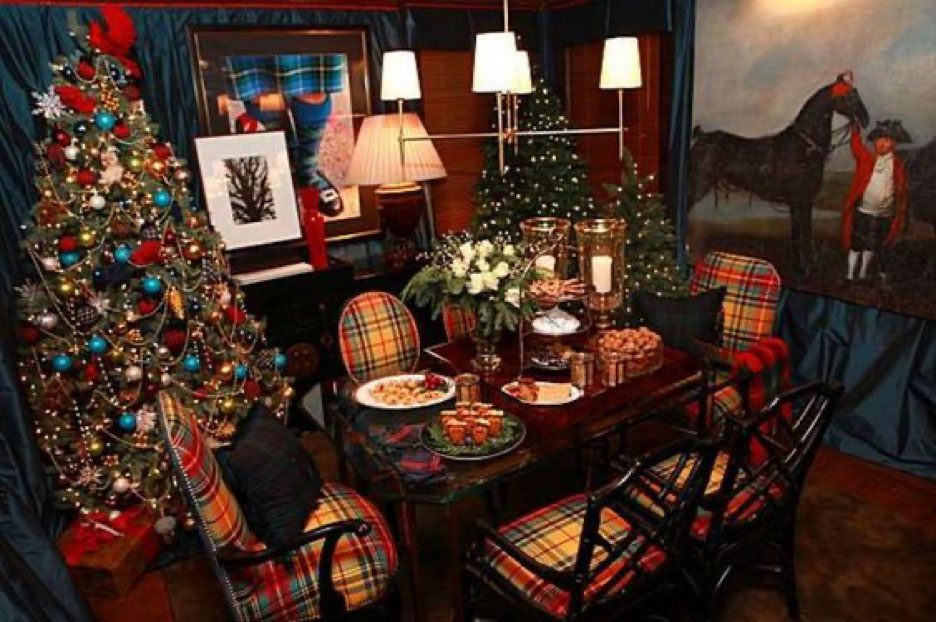
Nothing brings together timeless tradition and cozy holiday charm quite like tartan. With its rich colors and classic patterns, tartan adds instant warmth to any space—whether draped across a fireplace mantel, wrapped around your Christmas tree, or woven into festive table settings. A tartan-inspired holiday theme blends rustic comfort with elegant heritage, creating a Christmas atmosphere that feels both nostalgic and beautifully refined.
Follow these 3 easy steps, and sit back and enjoy.
1. Pick a Theme
I love traditional Christmas plaid and tartan decorations. Think Ralph Lauren in Connecticut on Christmas morning. Having this base to refer to makes shopping easy. But it’s not about me, it’s about you. What do YOU like? All white? Modern? Country? Pick a theme and go with it.
Here are my favorite picks for this year.

2. Vary It Slightly
Now that you have a signature look, vary it slightly from room to room. I mix different tartans and plaids in different areas. More formal rooms get silver champagne buckets holding mini trees with tartan ribbon. Kids areas get buckets holding trees, tartan blankets and shams. Keeping the same thread running throughout keeps everything working together.
3. When in Doubt, Add More!
This is not the time for subtlety. Your house is only going to be decorated for a month, max. Pull out all the stops and enjoy. It will be gone before you know it.
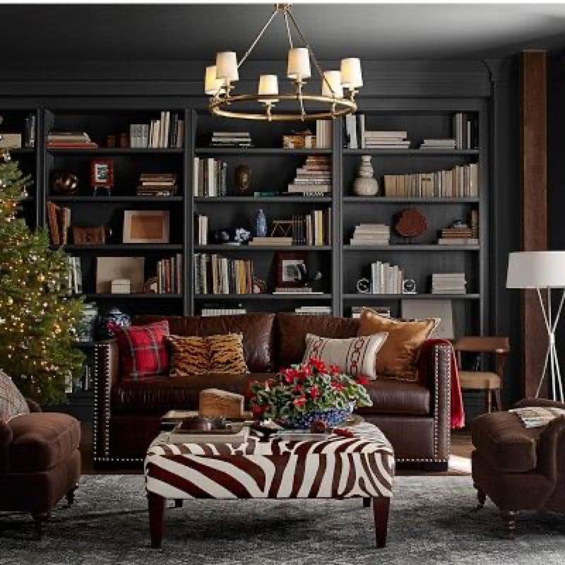
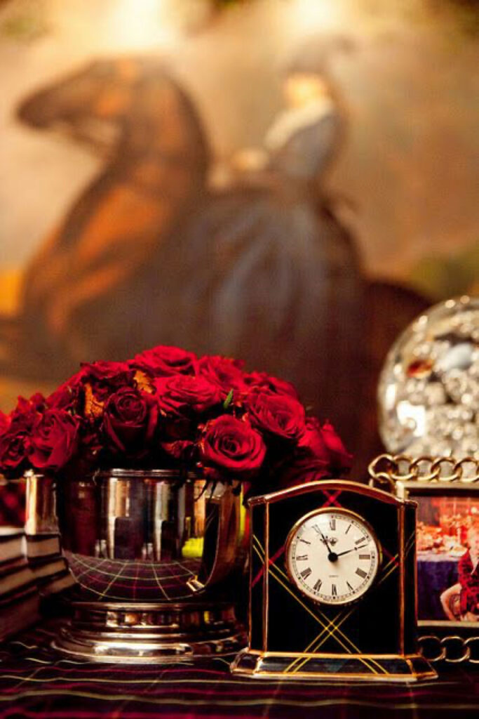
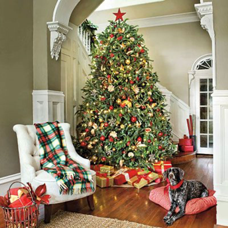
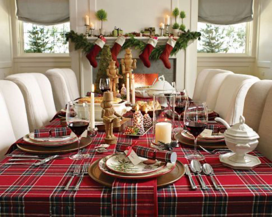
Now that we have a few guidelines, let’s see some inspiration images in my favorite look. Several are from my home. Enjoy! Sources and buying info at the bottom.

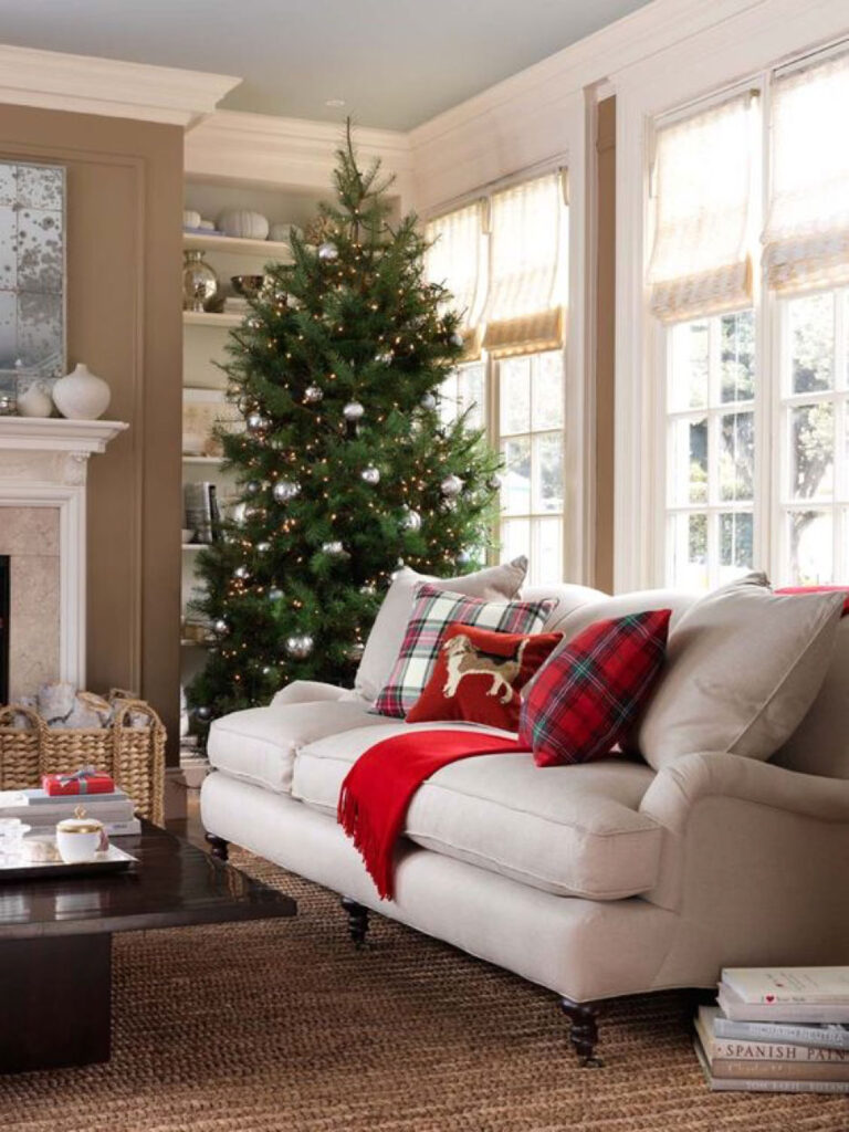
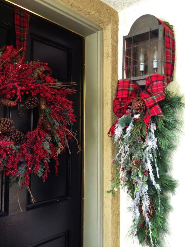
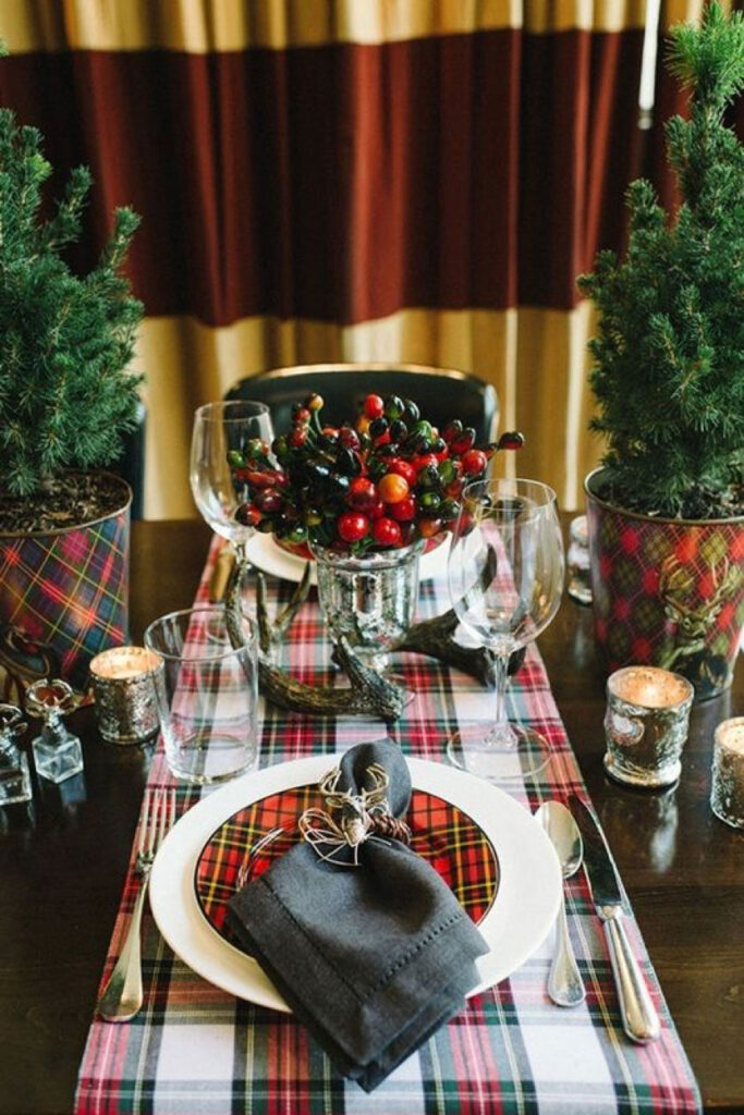
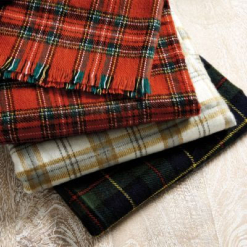
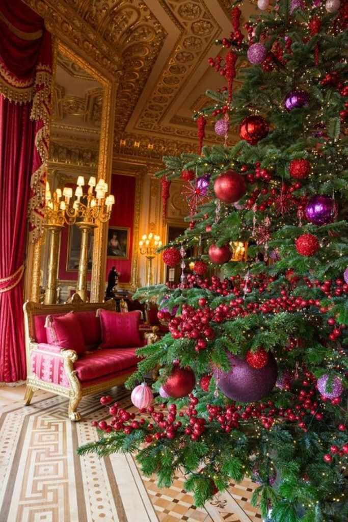
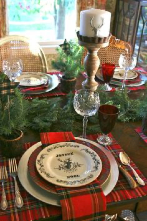
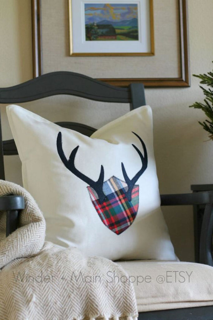
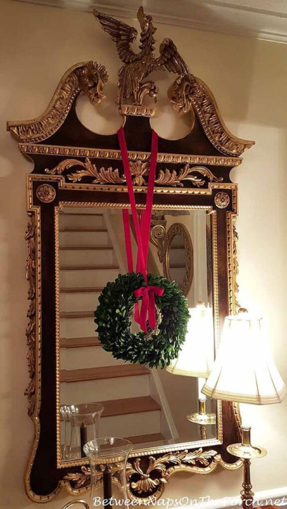

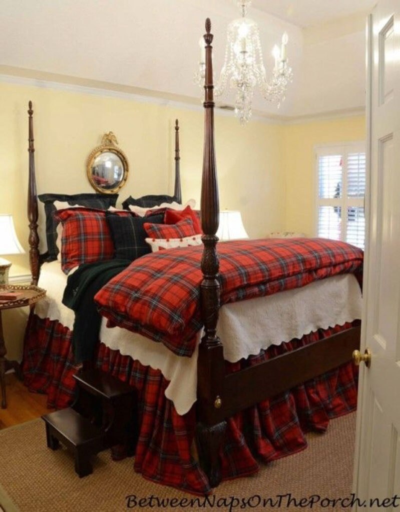
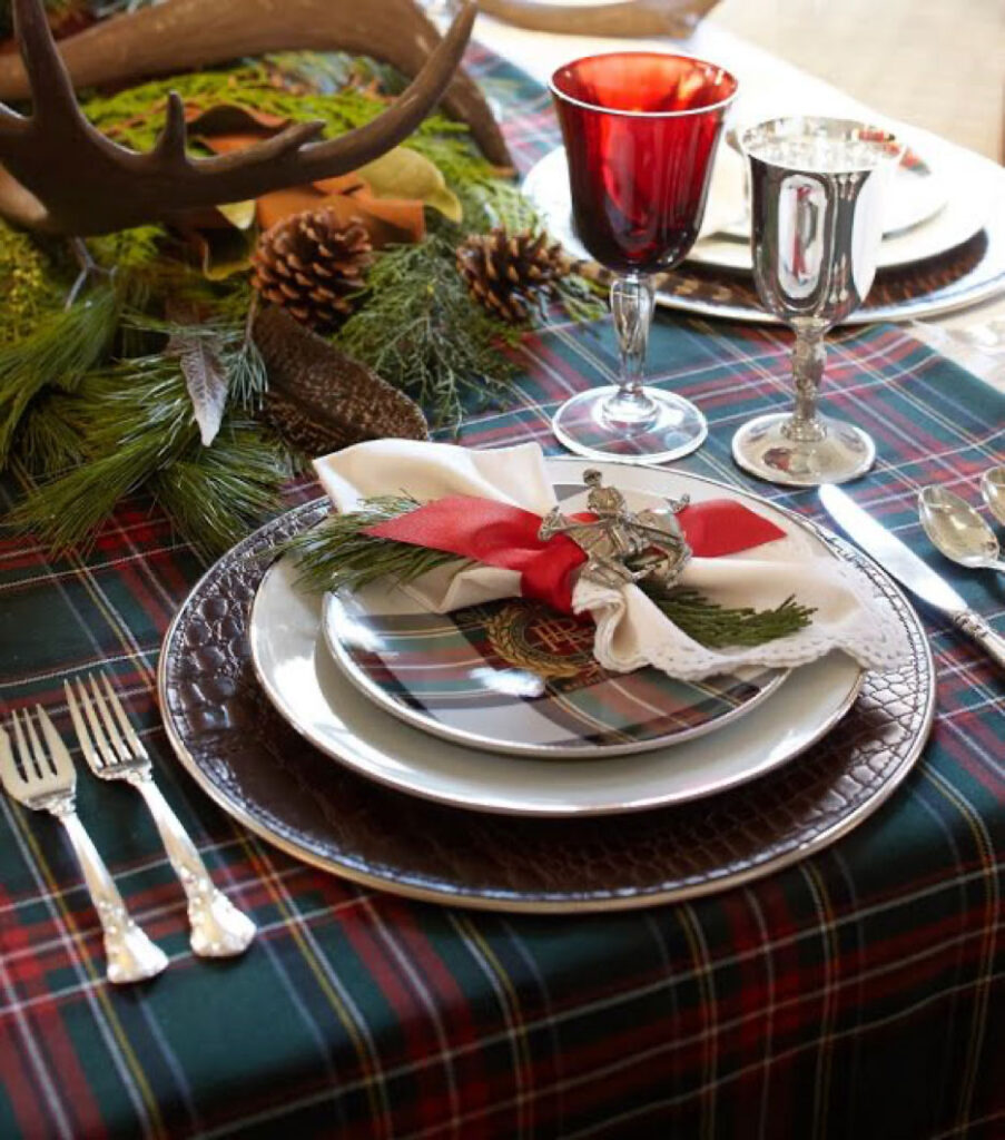
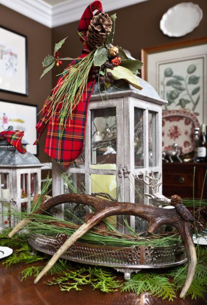
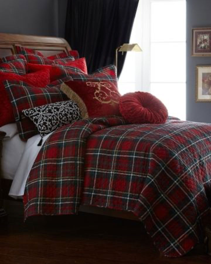
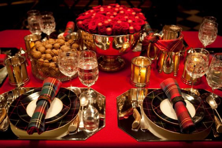
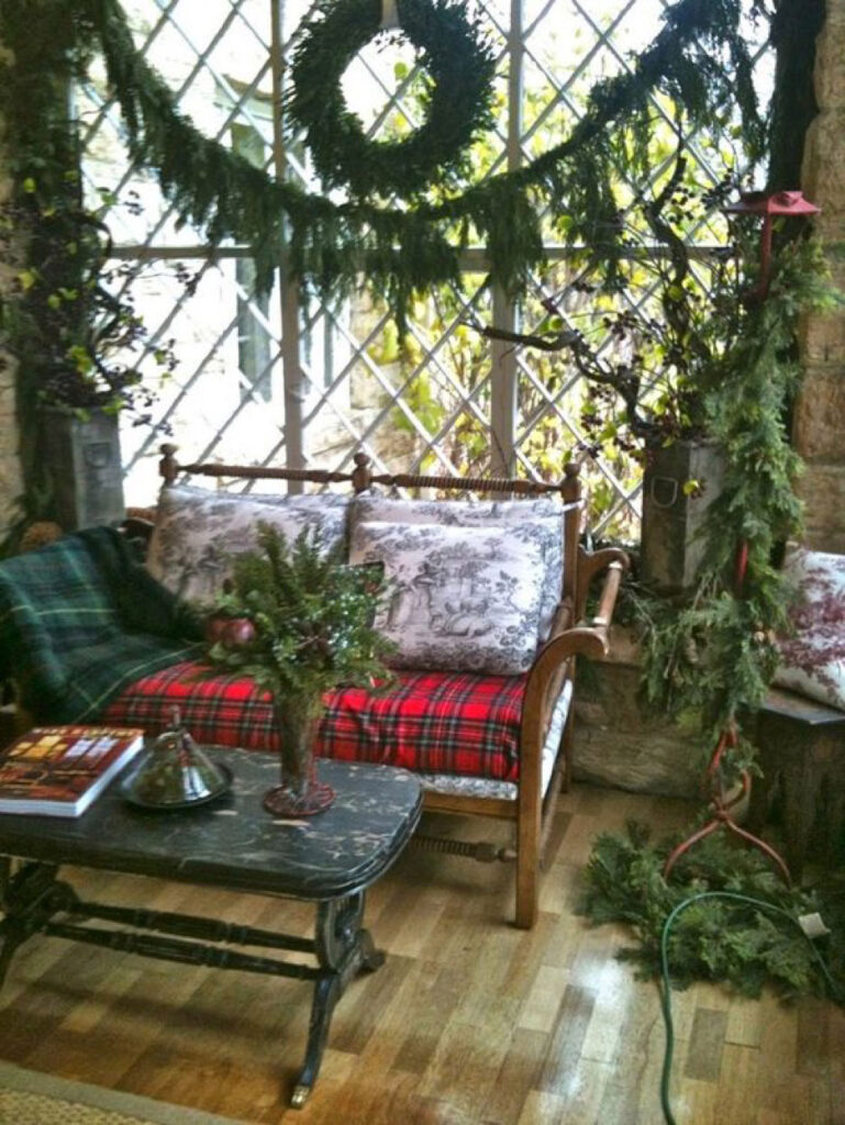
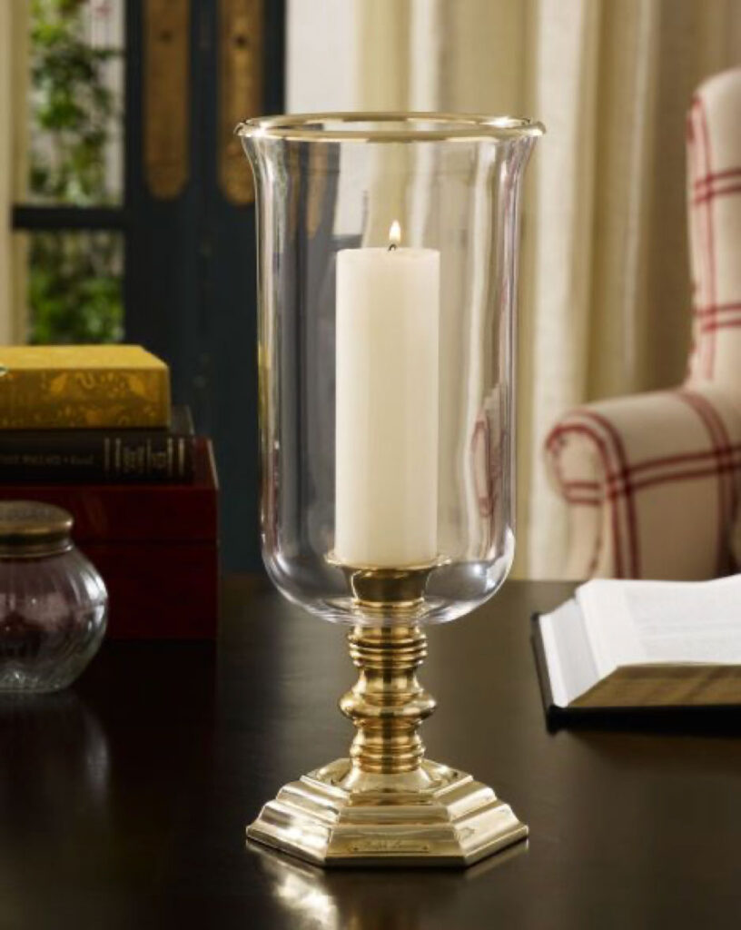
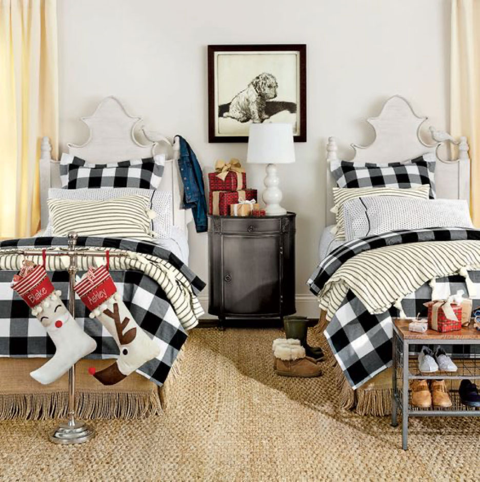
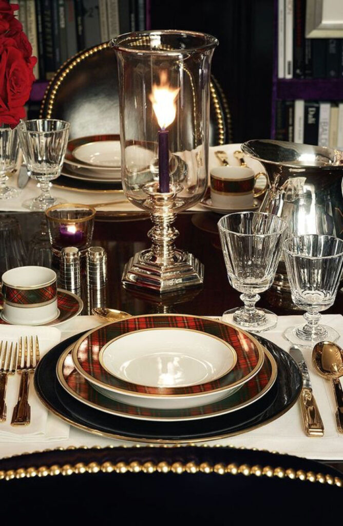
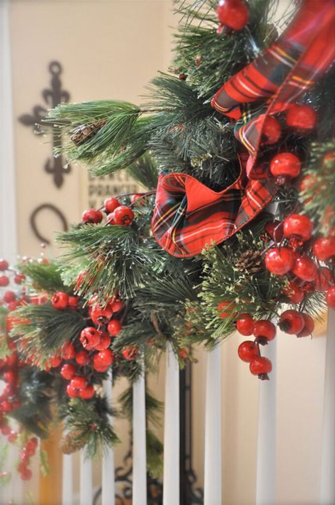
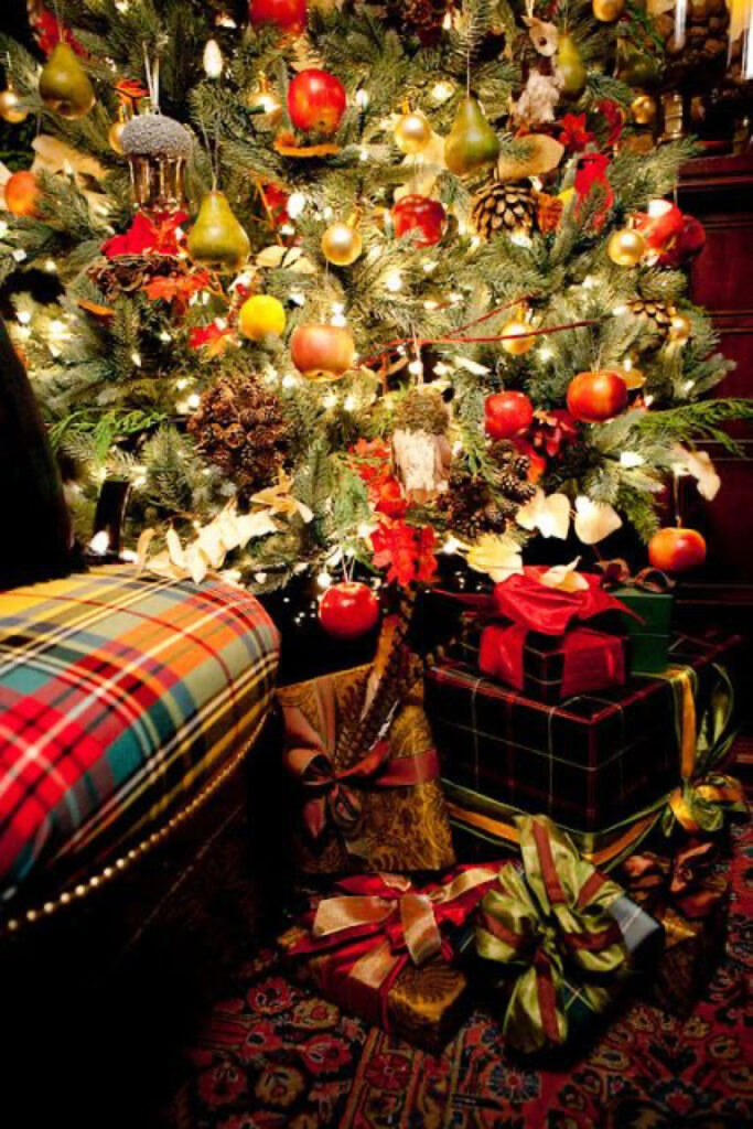
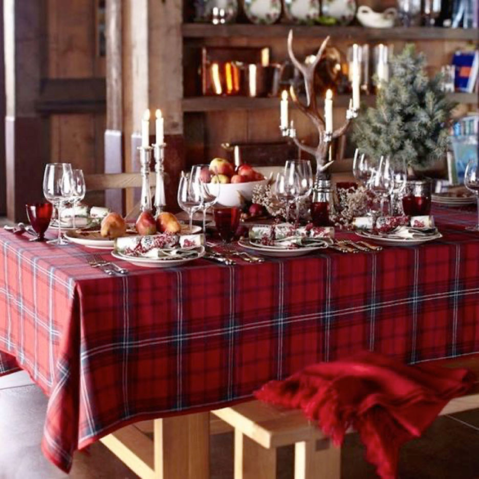
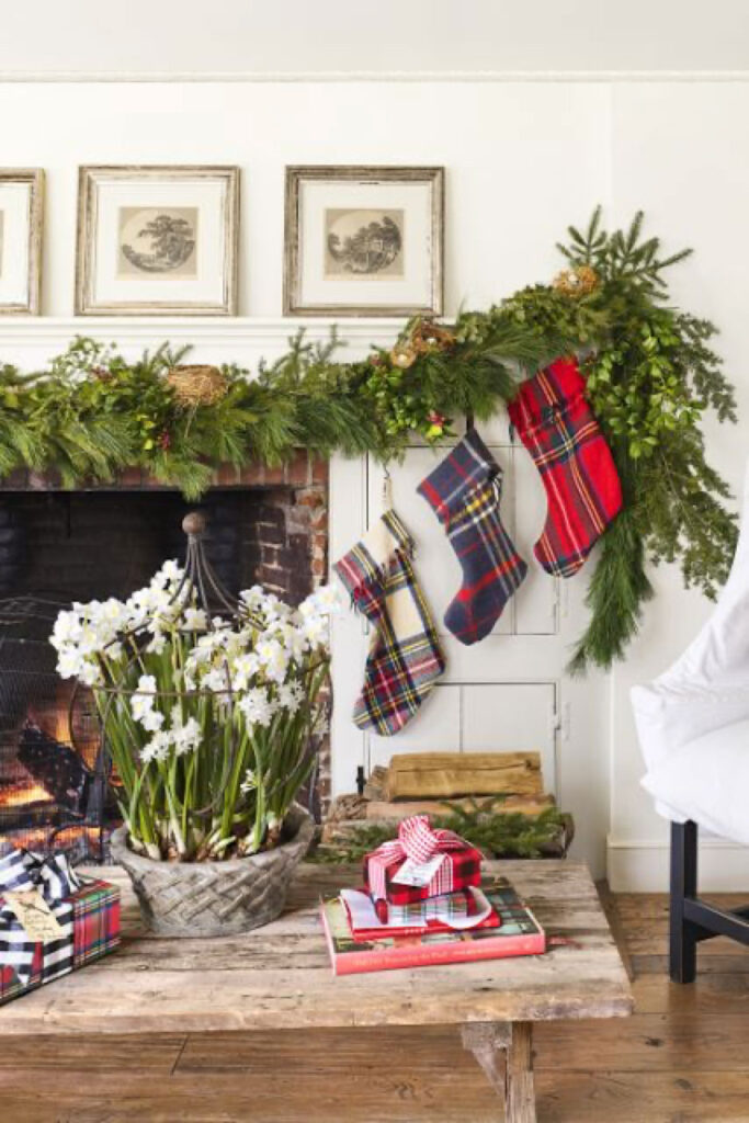
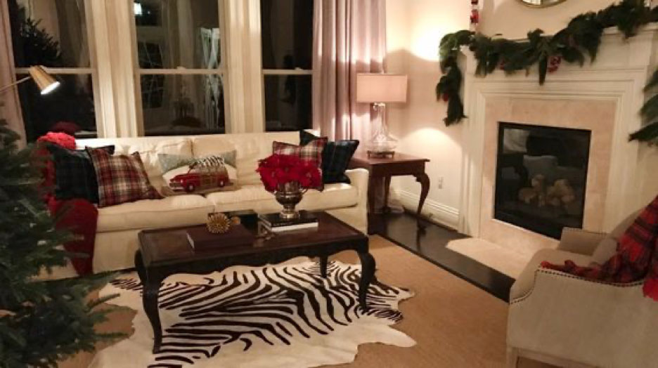
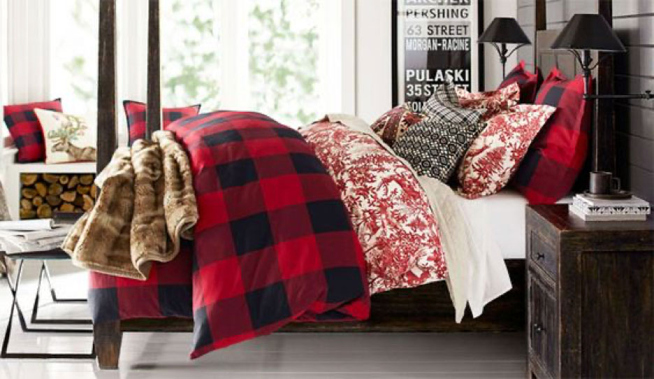
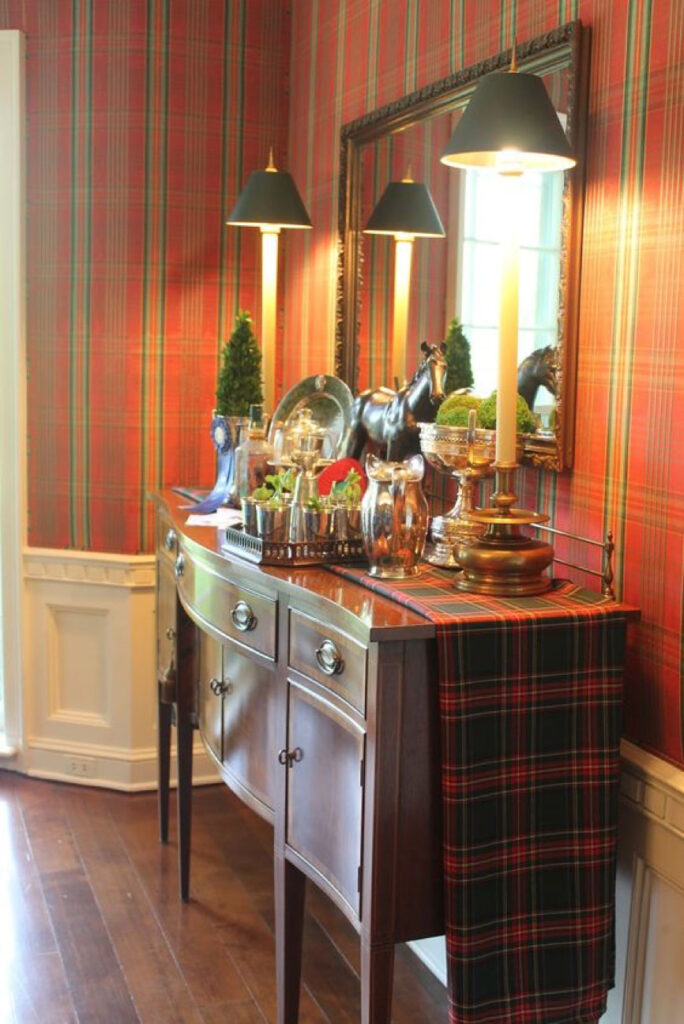
Here’s a couple handy graphics for your Pinterest boards with links below!

FILED UNDER
Share ON


Are you buying for a beauty lover this year, and are stuck for ideas? This Beauty Gift Guide Under $48 is full of incredible gift ideas!
Geranium Shower Gel – This invigorating shower gel is ideal for anyone that loves trying new body products.
Geranium Body Balm – With a fresh, citrus scent, this body balm is the perfect gift for any high end beauty lover
Geranium Body Scrub – Fancy gifting an indulgent body scrub? This body scrub is ideal!
Rose Hand Cream – Hand cream is a classic gift idea that always goes down a treat.
Shower Foam – A gorgeous rose scent is sure to be a hit!
Sabon Shower Gel – Enriched with essential oils, the relaxing scent moisturizes skin beautifully
Headband – Are you buying for a skincare lover? A headband is an ideal gift!
Mango Lip Balm – A classic premium lip balm that makes a fabulous gift
Beauty Blender – Have a makeup lover to buy for? A beauty blender is always a very welcomed gift
Dry Brush – This dry brush would be perfect if gifted with a shower gel or body scrub!
Catchall Tray – You can never have too many trays! These are great ideas for those who collect perfumes
Cosmetics Bag – Another essential for any beauty or makeup lover!
Bath Oil – This romantic scented bath oil is a super luxurious gift that everyone will love!
L’Ombre Dans L’Eau Bar Soap – A heavenly scented bar of soap that would be perfect in a powder room
FILED UNDER
TAGGED
Share ON
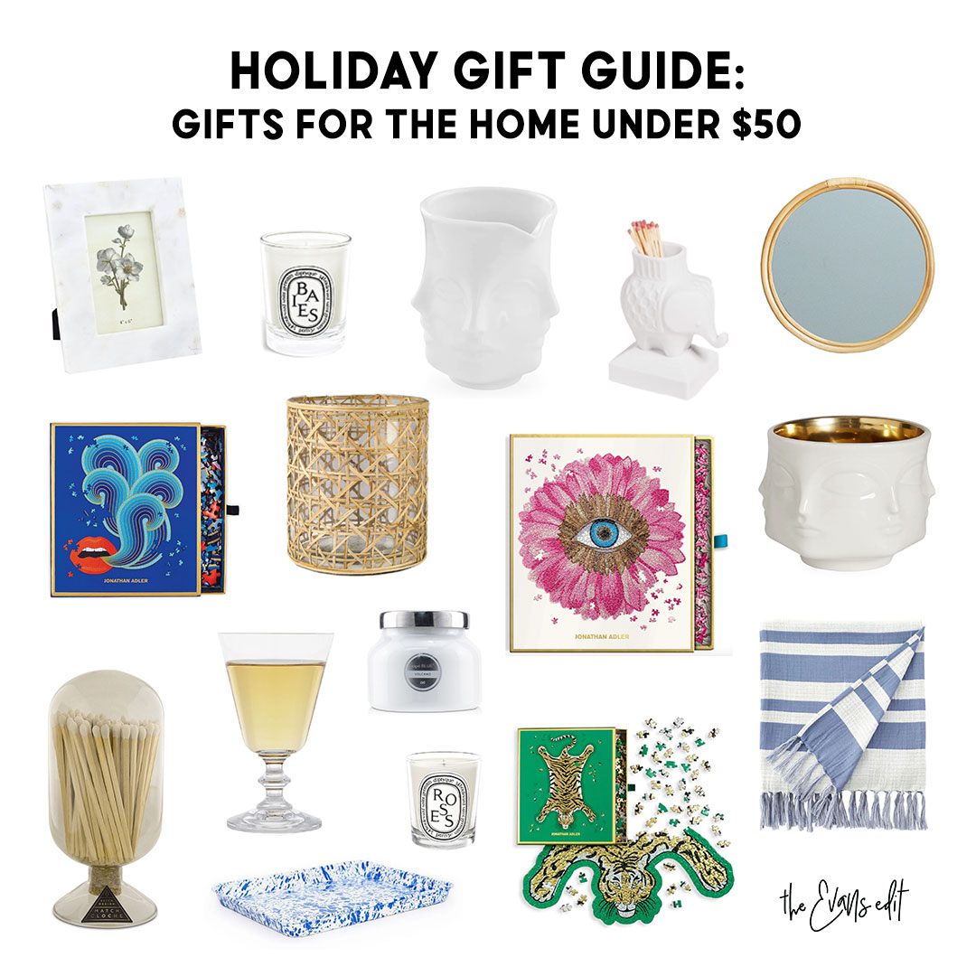

Kicking off this year’s Gift Guides with this Under $50 Collection! All these items are perfect ideas for anyone that loves all things interior design and decor.
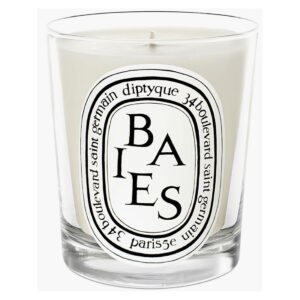
Baies Candle – A staple scent for any home!
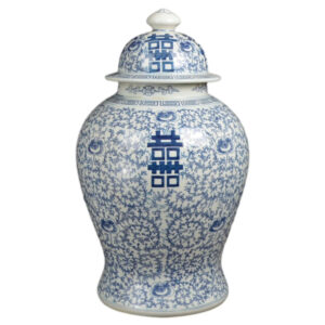
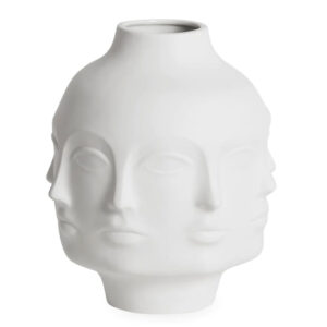
Small Vase – Give them something to small and talk about with a stylish vase
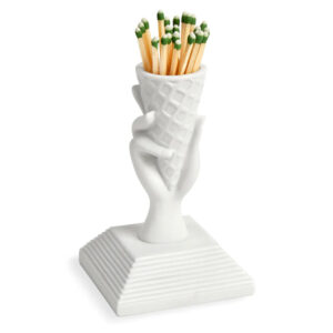
Elephant Match Holder – Perfect for adding character, and will look fantastic in any space
Lips Puzzle – Great fun while also doubling up as a beautiful coffee table item!
Flower Puzzle – This would look amazing on a table surface or nightstand
Muse Bowl – A super stylish piece that would look fabulous in any home
Roses Candle – Another staple scent! The perfect gift
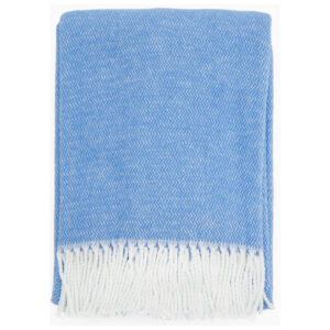
Blanket – A neutral blanket to go with any interior style
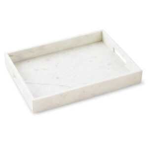
Tray – The perfect gift for jewelry wearers
Mirror – A staple gift idea!
Marble Frame – Timeless pieces that will work in any space are great gift ideas, just like this frame
Match Cloche – Great for accompanying candles
French Wine Glass – Shopping for a wine lover? Consider these glasses!
Volcano Candle – Stylish candles are always a good idea
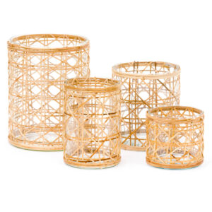
Hurricane – Cane wrapped hurricanes are great for any Boho lovers
Safari Puzzle – Another fun game idea that doubles up as a stylish piece for a coffee table!
Looking for the perfect gift for someone that loves interior decor? Scented candles are always a winner, while the fun Flower Puzzle, Lips Puzzle and Safari Puzzle make super stylish gifts! They would look beautiful on any coffee table or nightstand.
Otherwise, choose neutral accessories like white vases, frames and light colored blankets, as these items will complement any existing interior!

FILED UNDER
TAGGED
Share ON

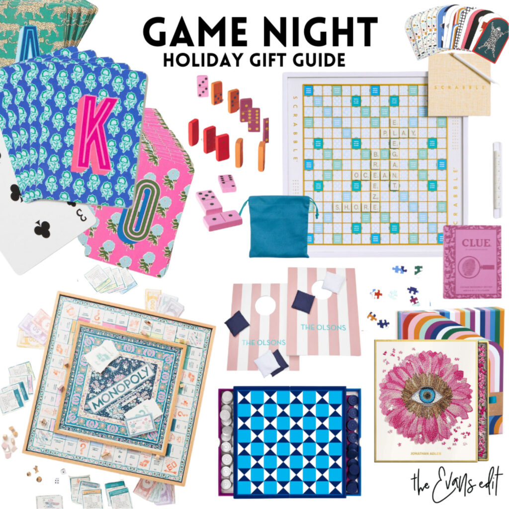
Playing Cards | Dominoes | Scrabble | Memory Game | Checkerboard | Clue | Abstract Puzzle | Bean Bag Toss | Monopoly | Backgammon | Petals Puzzle
Every family loves to get together and have some fun with a Games Night! Here are my top Holiday Gift Ideas for giving to those that love games!
Playing Cards – A staple for any family home!
Dominoes – Simple, yet super fun for all the family to enjoy
Scrabble – Ideal for gifting to someone who loves literature and words
Memory Game – A great game to test everyone’s memory! Who will come out on top?
Checkerboard – Another classic board game that every family should have!
Clue – Do you know someone that loves murder mysteries? A fun game for them!
Abstract Puzzle – Everyone loves a good puzzle
Bean Bag Toss – Perfect for families with young kids!
Monopoly – A boujee Monopoly board anyone? Yes please!
Backgammon – A classic game, but always enjoyable to have in the house
Petals Puzzle – Ideal for those that love to enjoy quiet time at home
FILED UNDER
TAGGED
Share ON


