Roman Holiday Poster – An iconic poster from the beloved 1953 film, with it’s romantic portrayal of Rome.
Coin Purse – Say hello to this petite italian leather coin clutch, great for holding your cash, cards, lipstick, and love notes.
Sunglasses – Grab your sunglasses, and hop on a vespa to tour your next sightseeing adventure.
Anemone Arrangement – No green thumb? No problem. Faux florals let you bring the garden inside and stay looking fresh all year round.
Antique Postcards – A beautiful set of antique black and white/sepia toned postcards from Venice, ITALY; perfect for your travel journal!
Straw Tote – Perfect for taking everywhere—from the farmer’s market to your next beach vacation.
Roman Holiday Scarf – Stand out in a crowded market with an iconic scarf accessory.
Chanel Lipstick – Color your lips with this iconic rouge allure that wears like a second skin.
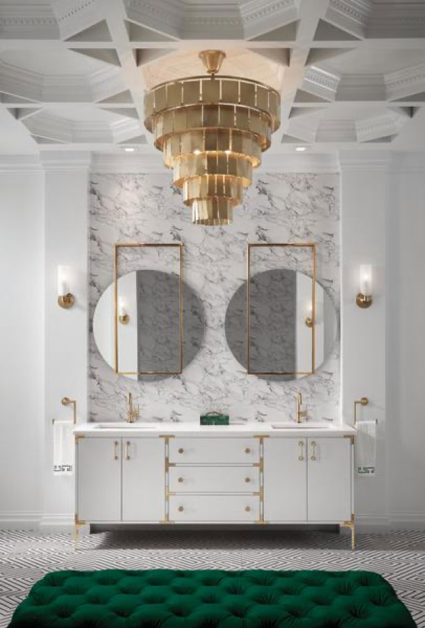
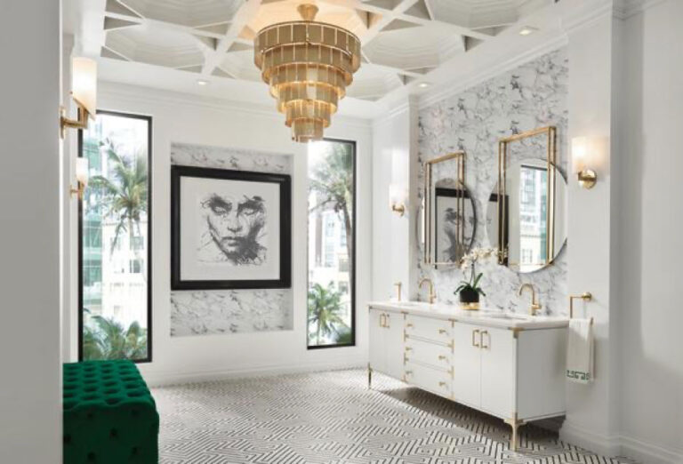
Chandelier – Made of alabaster stone, this elegant design, featuring a fluted band pattern that adds a touch of sophistication to any space.
Maritime Candle – Designed by Ben Arpea, the seasonal exclusive candle diffuses a scent embodying the essence of a shaded trail beneath maritime pine trees.
Espresso Machine – Add elevated style to your kitchen with the Dolce & Gabbana Blue Mediterraneo collection, perfect for brewing rich shots of espresso.
Travel Italy – Some of Italy’s most amazing landscapes and diverse regions are brought to life through the Great Escapes Italy 2019 coffee table book.
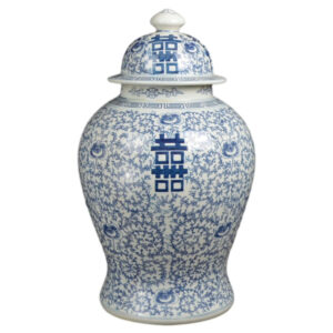
Murano Vase – Perfect for displaying a bouquet of fresh flowers, this tulip-shaped vase is hand blown in Italy with Millefiori accents.
Vespa Retro Print – This highly detailed reproduction of a vintage V&A exhibition poster screams vintage charm.
Wall Art – Blending elegance, history, and leisure, iconic photographer Slim Aarons captures the Temple of Poseidon in Paestum, Italy.
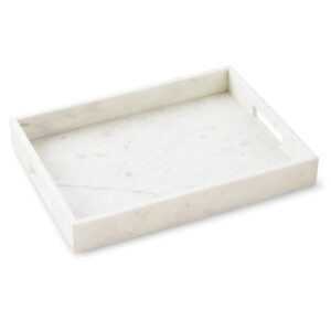
Sardines Tray – This stoneware serving platter brightens your tablescape with a splashy sardine motif.
Marble Side Table – Combining modern design with luxe style, this marble and brass accent side table from makes a versatile addition to your home.
Lounge Chair – A modern, Italian-inspired piece known for its sleek design and luxurious comfort.
Red Poppies – Add a touch of charm to any room with this esquisite floral arrangement.