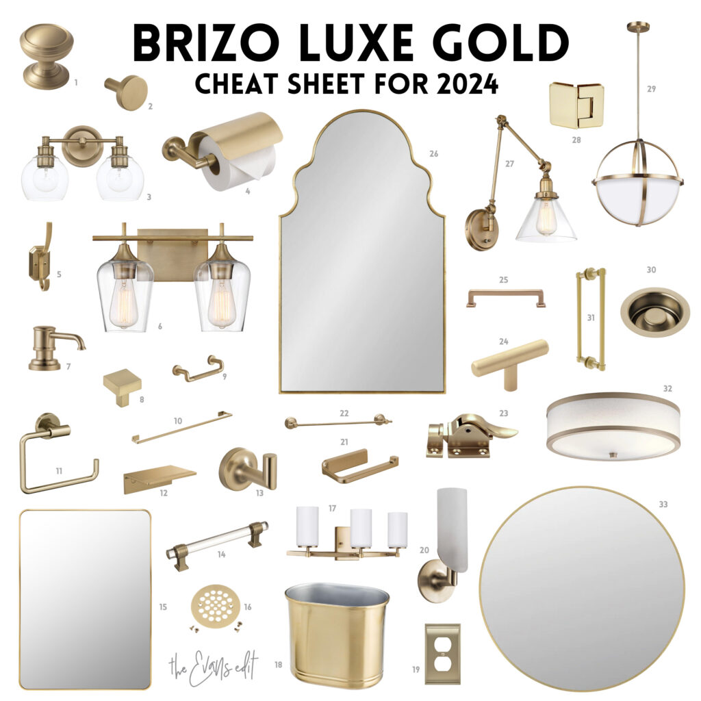
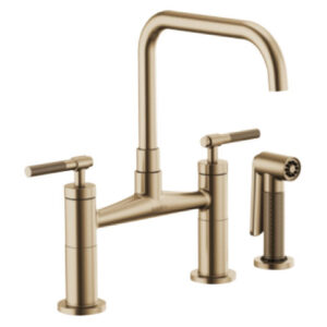
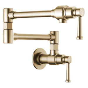
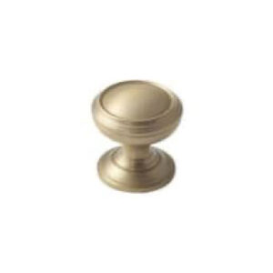
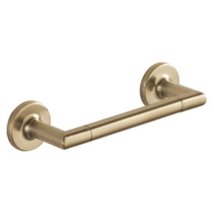
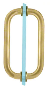
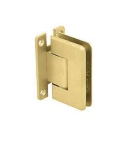
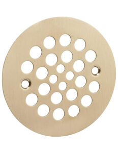
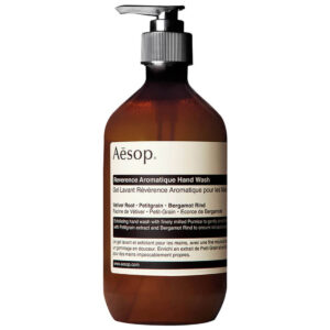
If you’re planning a bathroom or kitchen remodel in 2024, you’ll undoubtedly be considering plumbing fixtures. Among the latest and most captivating finishes available is “Luxe Gold” by Brizo. It’s a true showstopper! In this post, we’ll provide you with a valuable Cheat Sheet that includes helpful links to explore this stunning finish and the hard-to-find items to coordinate with it.
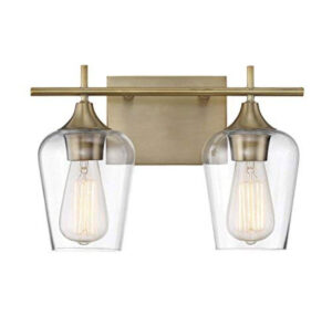
Luxe Gold truly distinguishes itself amidst the common finishes like Brushed Nickel, Chrome, Oil Rubbed Bronze, and the now-popular Matte Black. Its warm-gold tones can add a touch of luxury to your living spaces without resembling the bright brass fixtures of the ’80s. Instead, Luxe Gold exudes sophistication and style, making it an excellent choice for both kitchen and bathroom remodels.
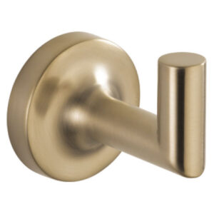
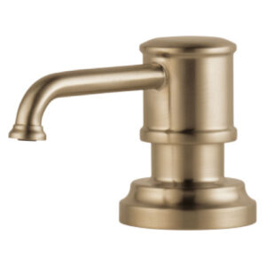
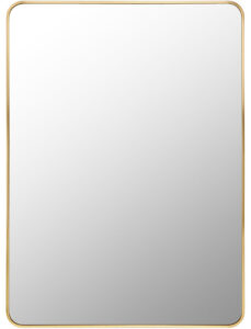
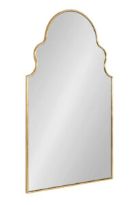
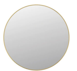
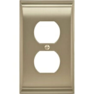
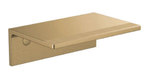
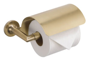
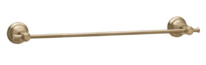
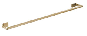
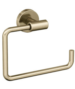
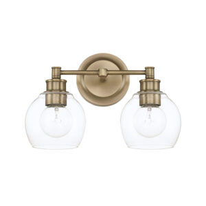
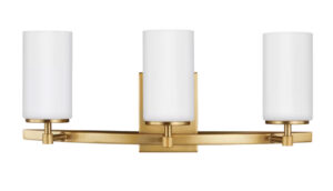
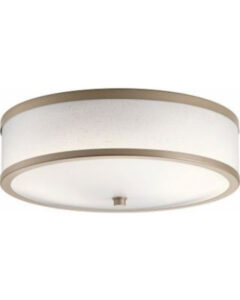
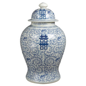
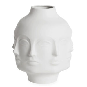
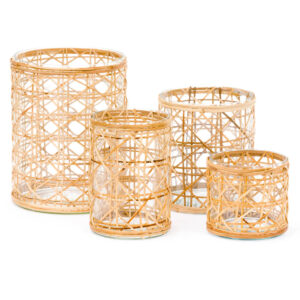
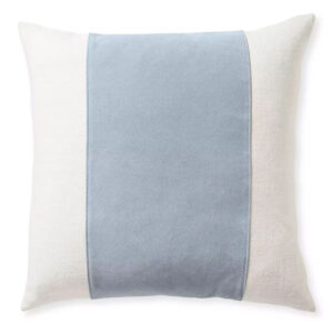
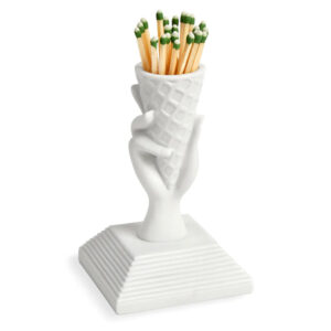
Here’s just a glimpse of what Brizo’s Luxe Gold collection offers:
Scroll *all the way down* for for the Cheat Sheet with links.
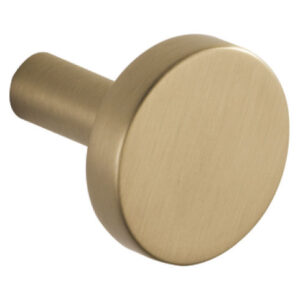
Luxe Gold definitely stands out in a sea of Brushed Nickel, Chrome, Oil Rubbed Bronze and (now) Matte Black. It’s the perfect warm-gold to bring a hint of luxury to your spaces. It’s not bright brass from the 80s, not even close. It’s sophisticated and stylish! They have everything you need for your Kitchen or Bath.
Here’s just a very small sampling…
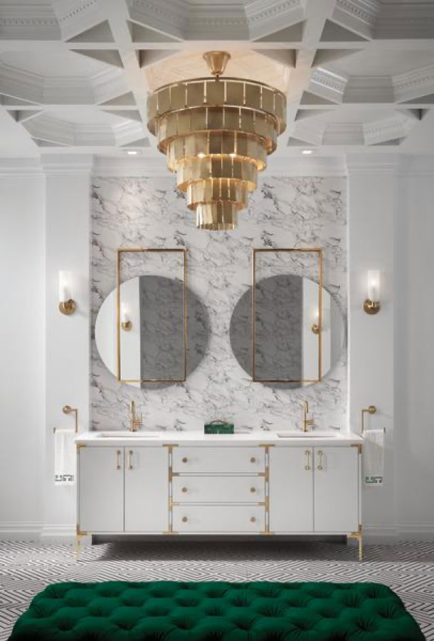
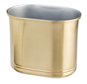
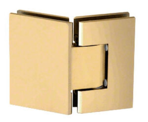
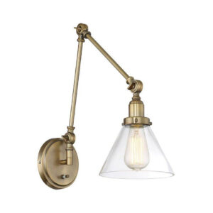
So, let’s say you’ve decided to use this lovely combination of plumbing fixtures in your home. Amazing! But… you need some things to coordinate with it too. Knobs… lights… mirrors… And you may be questioning, “What goes with this gorgeous finish?” Brizo makes a few things to coordinate – but not much – like one light…seriously.
so What actually coordinates?
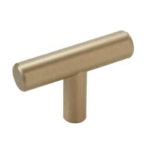
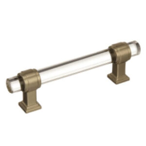
You can actually MIX the finish with other finishes…maybe matte black? That’s definitely a valid option. But, let’s look at what will actually coordinate with Luxe Gold from other brands so you’re not stopping short after choosing new plumbing fixtures. Here are a few of my favorites. Don’t worry, all the links are down below at the bottom of the post.
But wait…
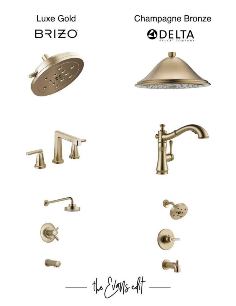
Is This The Same As Delta’s Champagne Bronze?
Before we dive into each of these items above (links are below) let’s address a mistake I almost made.
Is Brizo’s “Luxe Gold” finish interchangeable with Delta’s “Champagne Bronze”? I mean Delta OWNS Brizo…they look similar…they’re probably the same right?
No…no they’re not.
Brizo’s Luxe Gold is lighter, less “gold-y”. Delta’s Champagne Bronze is deeper and would mix easily with standard brass options. (Maybe we’ll cover that in the future!) But for now, let’s stick with Brizo’s Luxe Gold.
So let’s breakdown that Cheat Sheet. Scroll down for the all the links below!
So now we have a BUNCH of options to coordinate with the amazing Brizo Luxe Gold line. Here is a handy dandy Cheat Sheet for you, with links, along with one perfectly formatted for your Pinterest page.
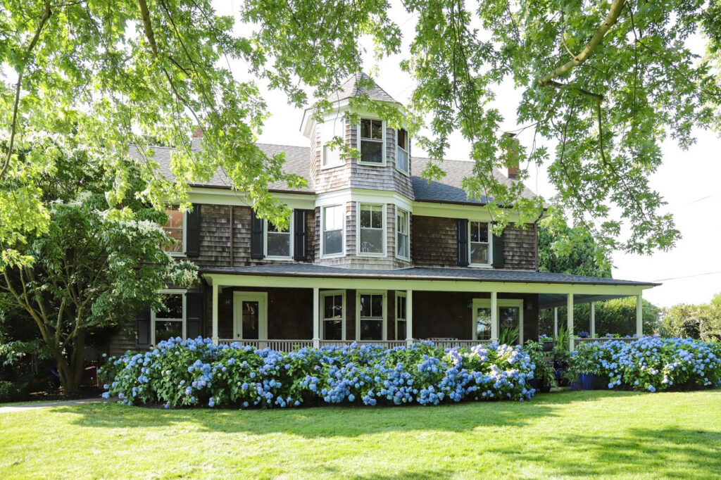
My family and I absolutely LOVE to spend time outdoors, playing in the backyard and soaking up the sun. Being in Florida, it was crucial that we got the garden and landscaping design right because it’s somewhere we spend a LOT of time!
So how did we get here? Where did the ideas start from, and how did we create the perfect landscape? Let’s explore just that and more – below! Each item is linked below, so be sure to scroll all the way down.
Where the design started
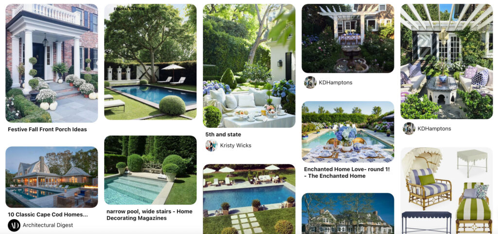
Similarly to any area of our dream home, I started by creating a Pinterest Board! And saving lots of ideas and inspirational images over the last few years. I started saving these idea waaaaay before we even started designing the house itself!
Another aspect of inspiration for the landscape and garden designs for our dream home came from following a number of gardeners on Instagram. I take you through some of my favorite designers and bloggers in my last blog post: Gardening Inspiration
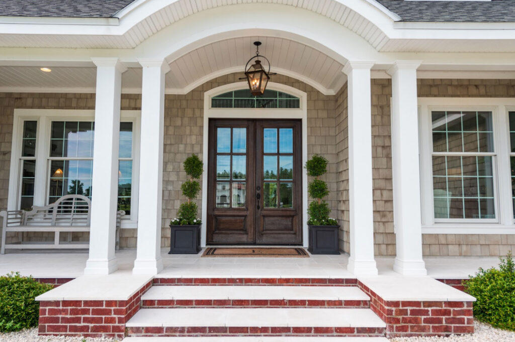
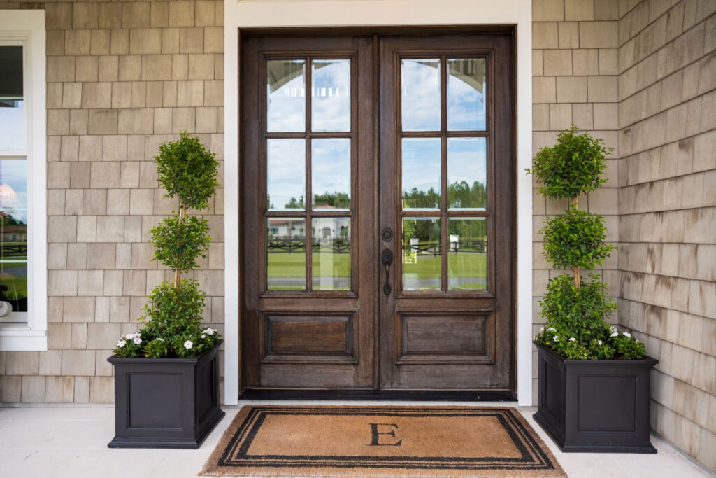
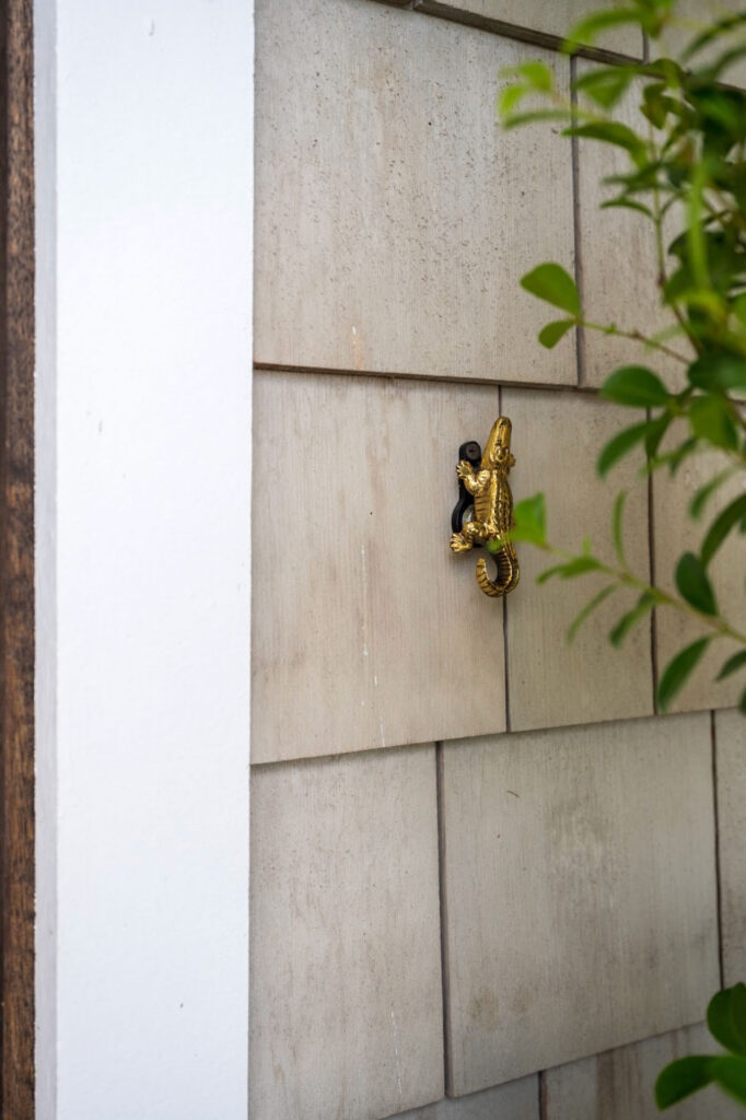
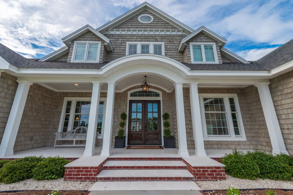
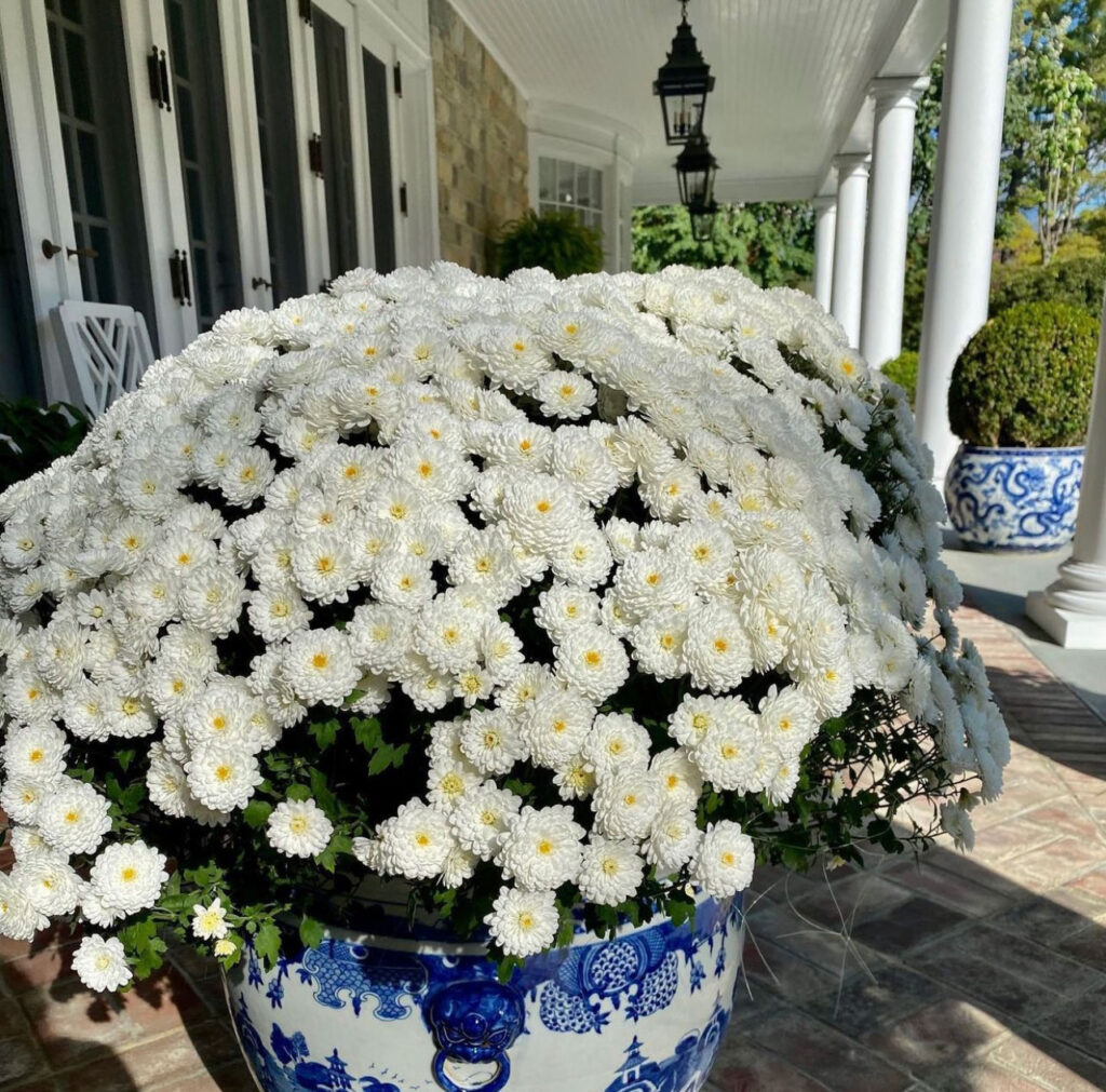
front porch
The front porch really sets the tone for the entire home, and other outside spaces of course. So when I focused on the front porch design, I made sure to include a large coir mat, potted structural bushes in large planters, and a bench for watching the world go by.
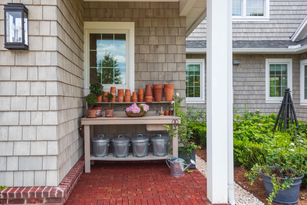
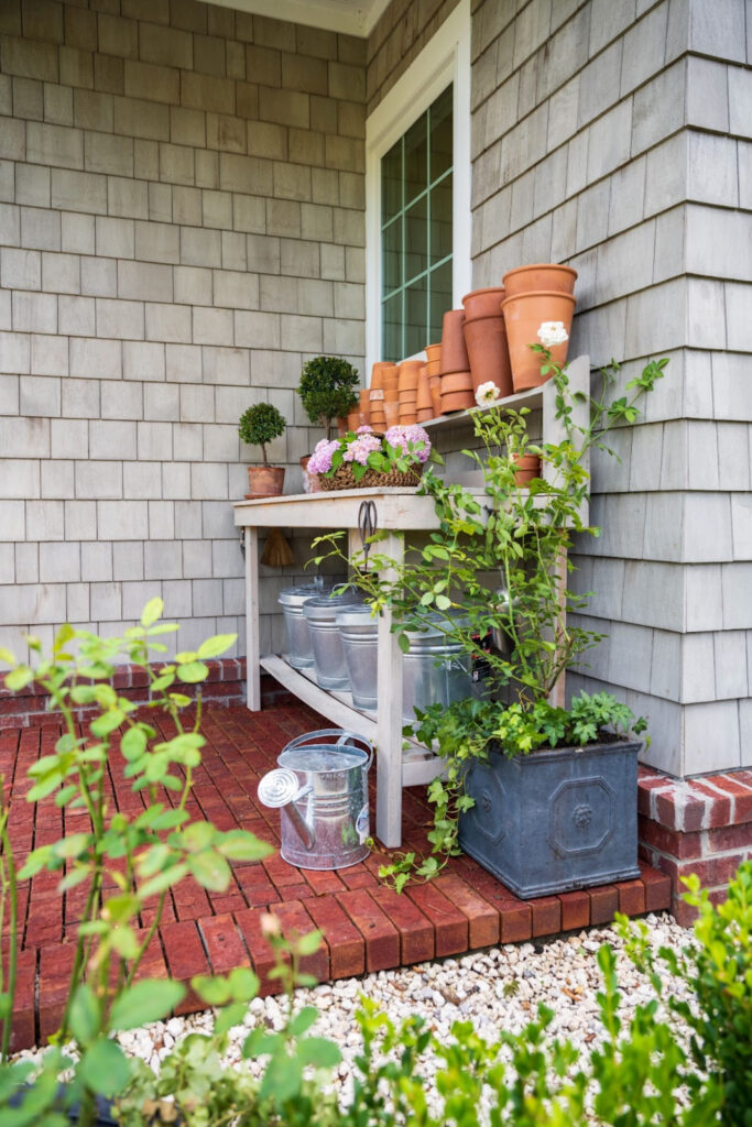
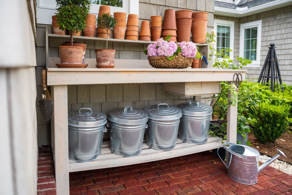
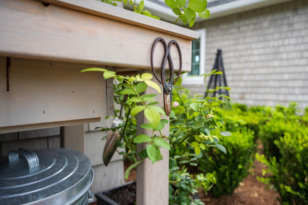
The "Potting Station"
I knew if I was really going to give this gardening a proper go, I needed a space to do that.
And so a Potting Station was created!
It’s a little corner tucked away where I can pot up and grow new plants. While it’s nothing fancy, it’s functional and stores everything I need!
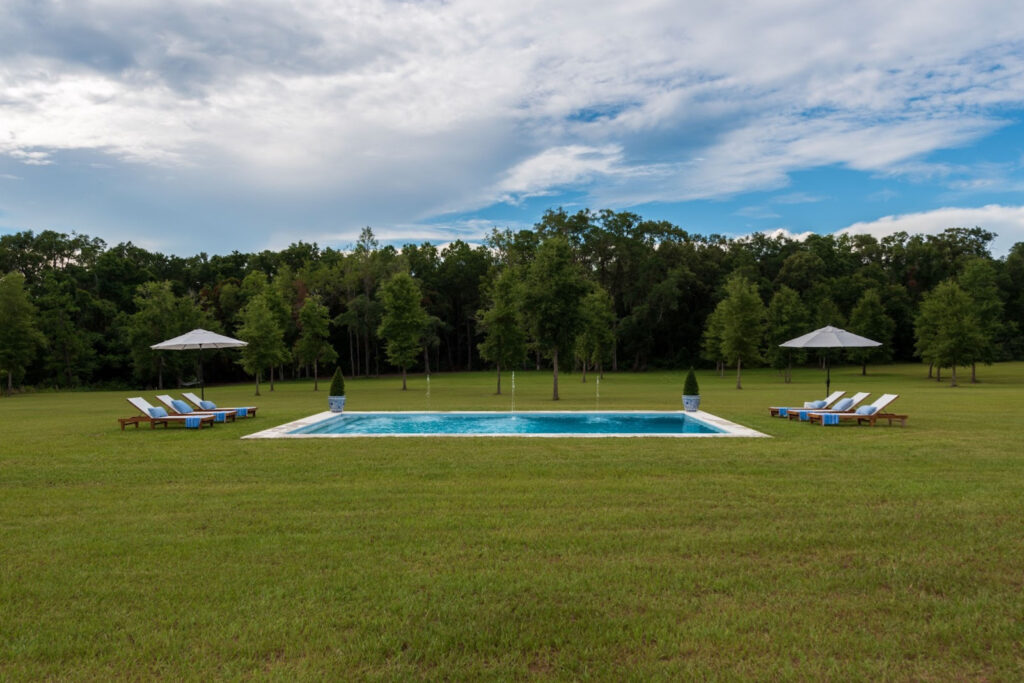
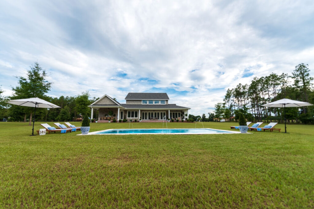
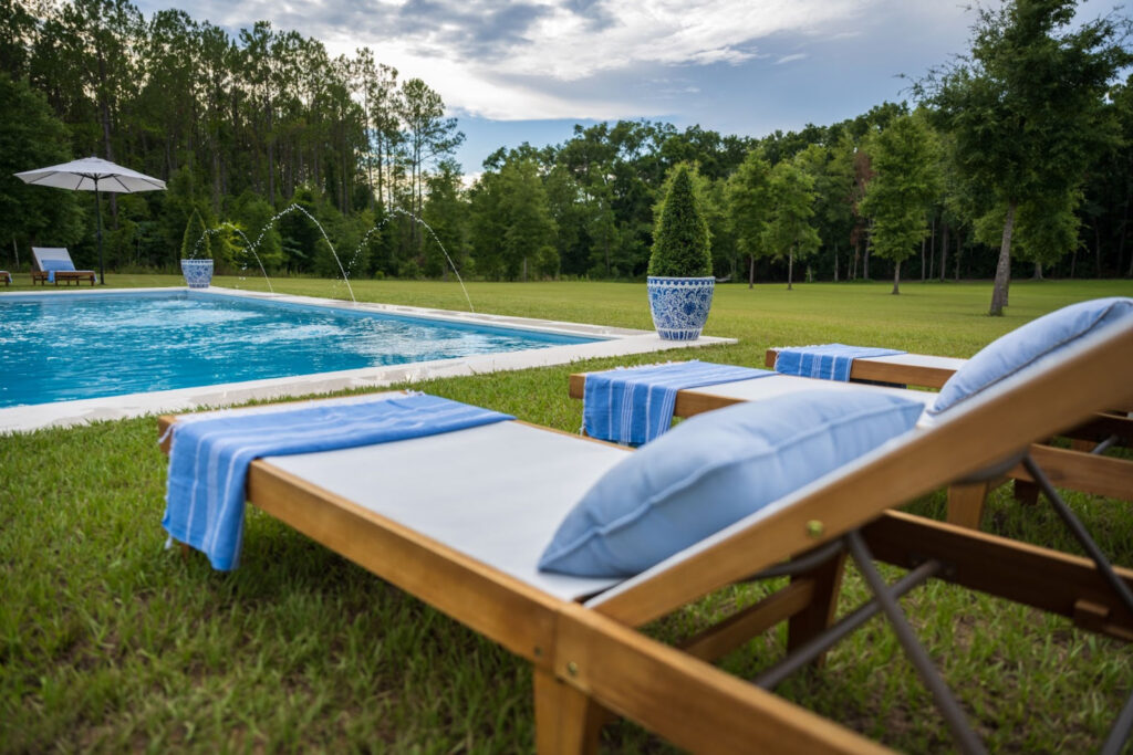
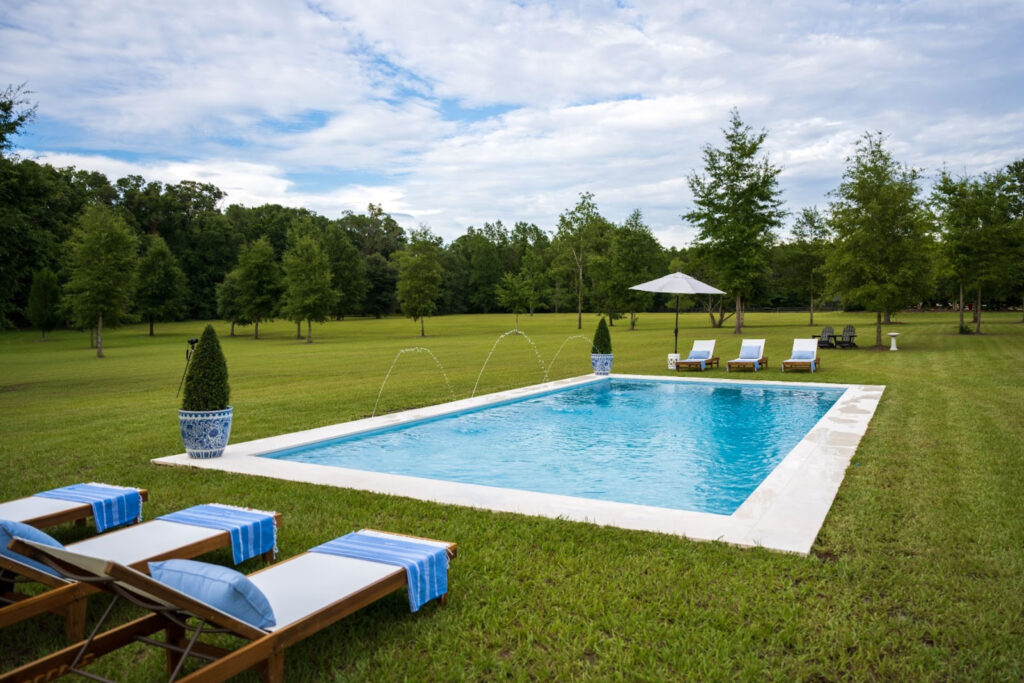
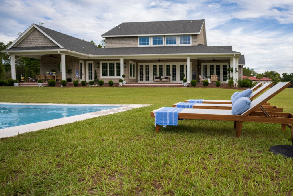
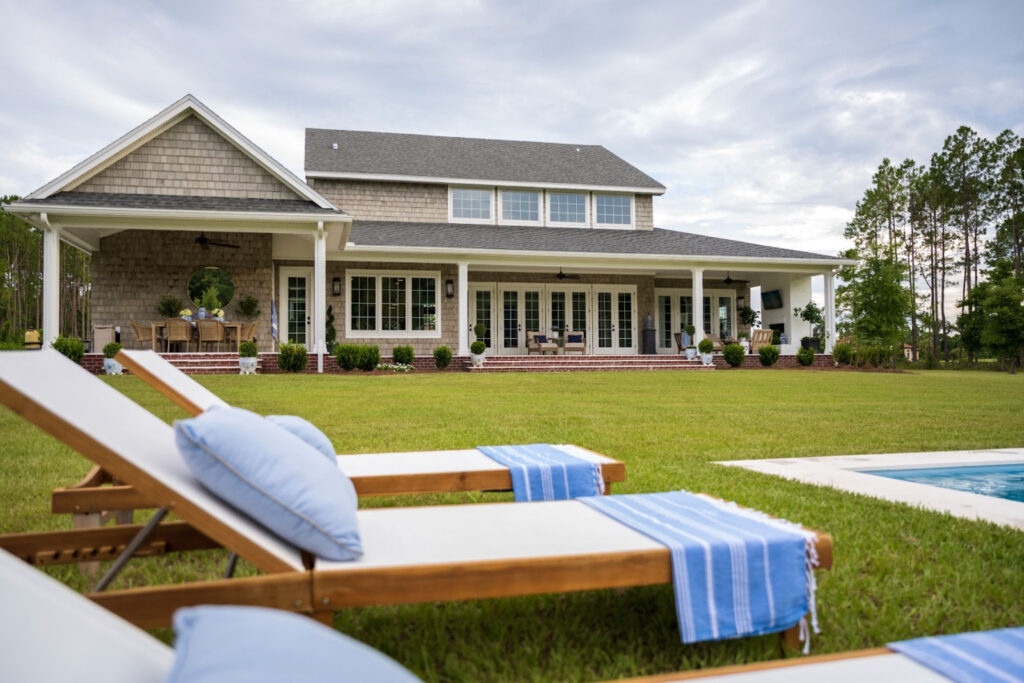
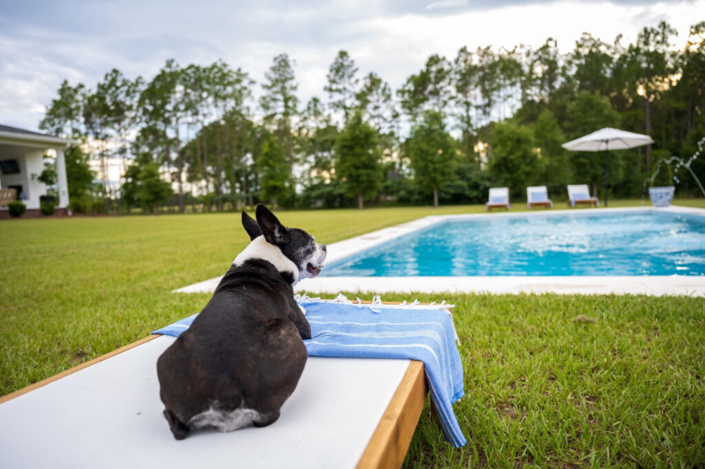
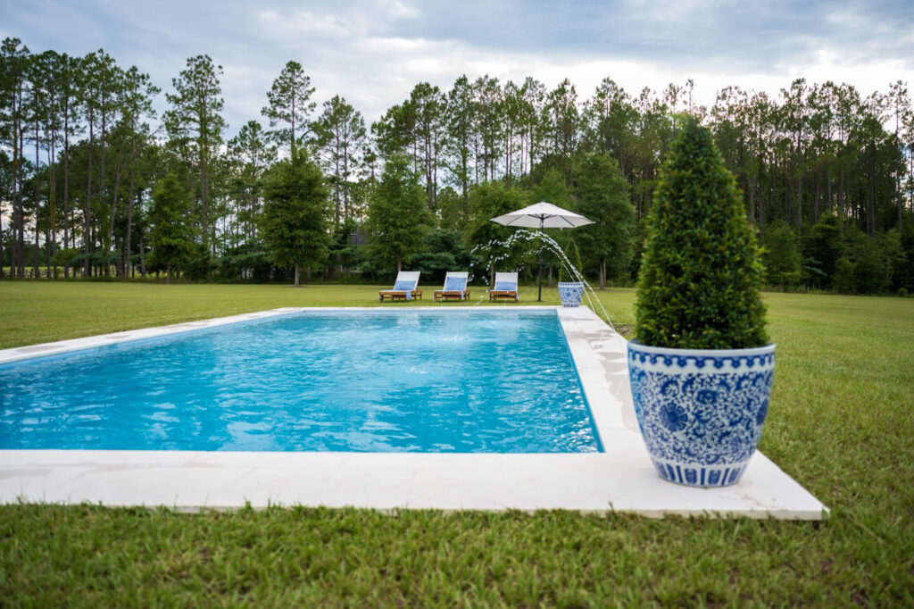
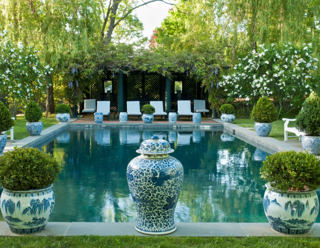
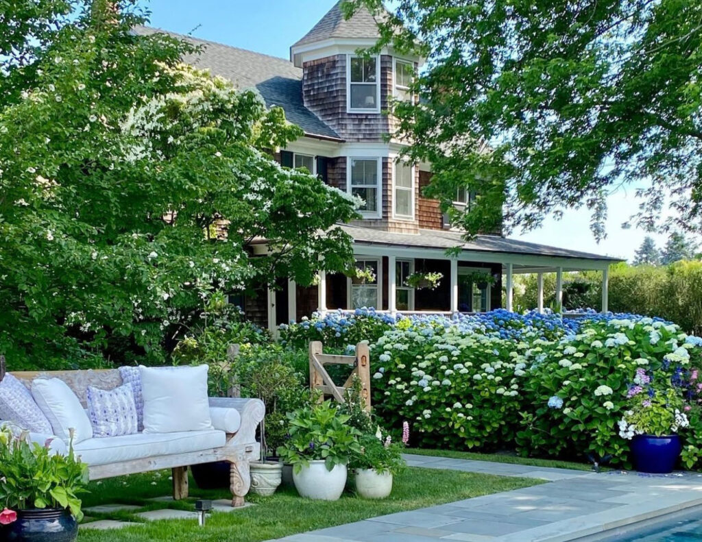
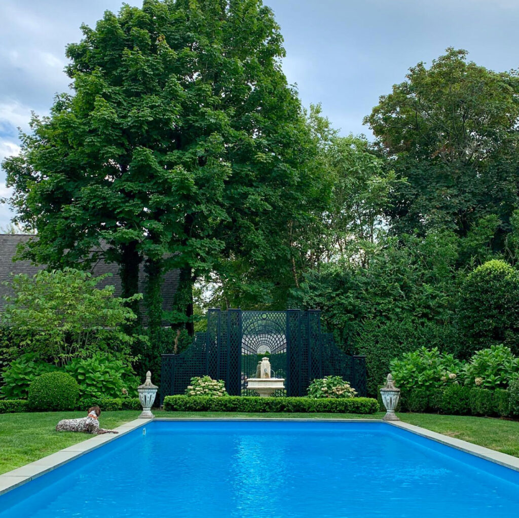
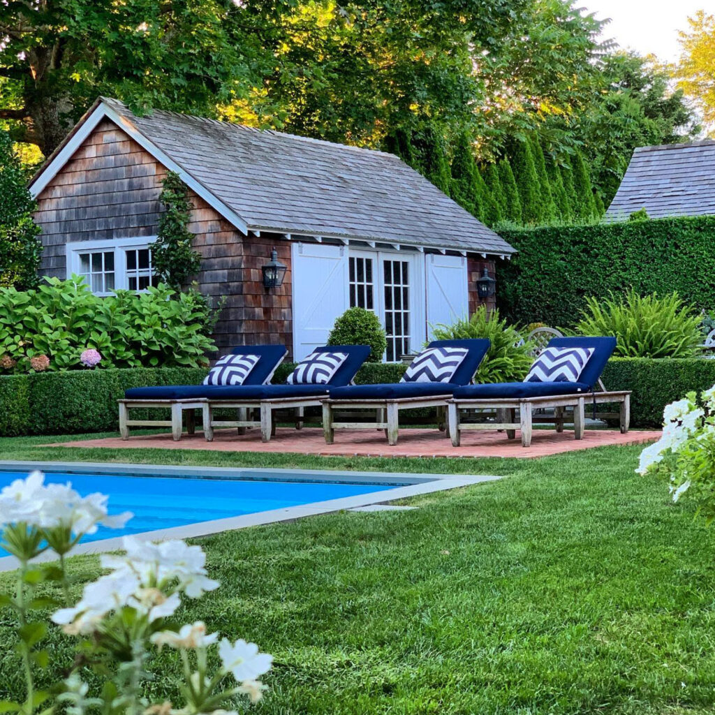
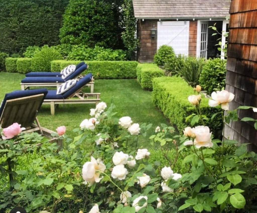
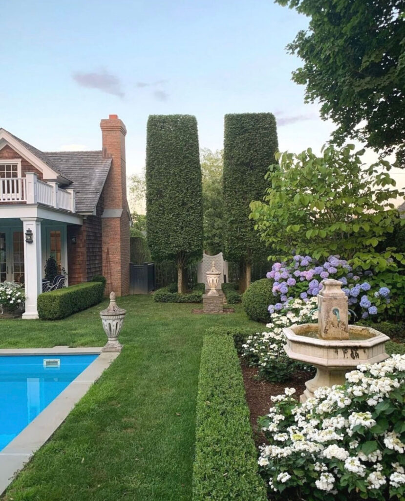
Pool Area
Ever since my husband and I first started talking about our dream home, I knew I wanted the pool area to be similar to The Hamptons. Clean and sleek materials with teak loungers and blue and white decor to finish the look.
Doggie Lulu loves the new loungers!
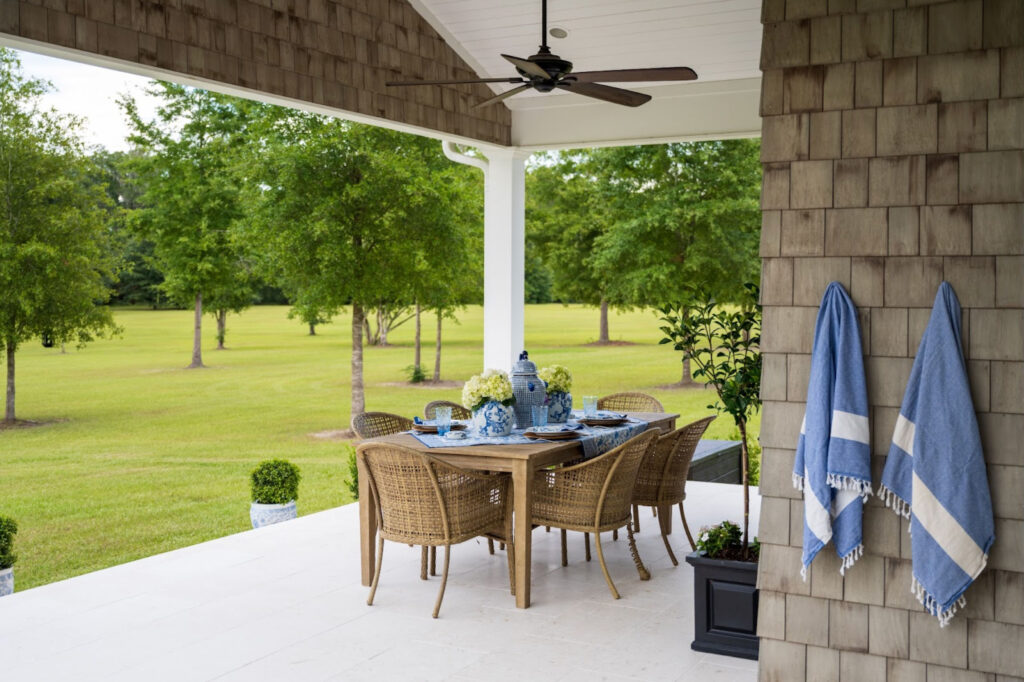
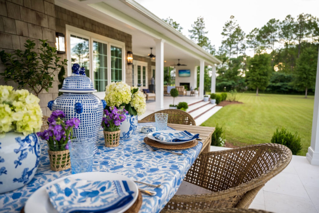
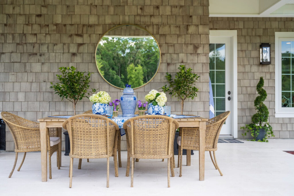
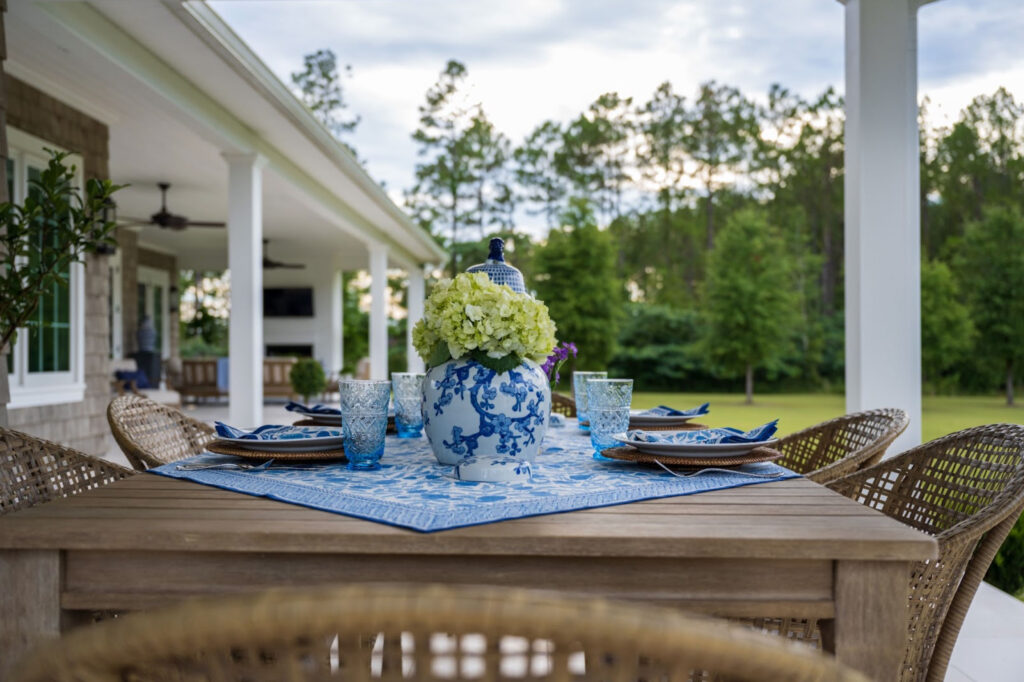
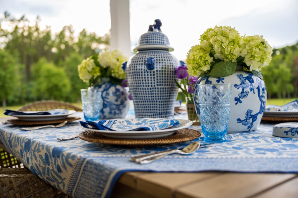
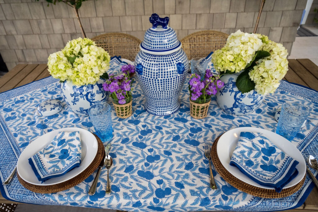
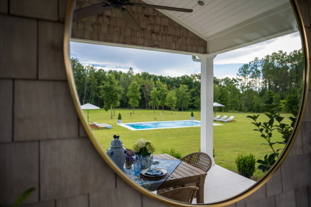
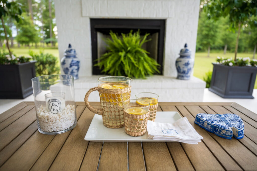
Outdoor Dining
When the evenings are warm outside we often enjoy dinner outside so an outdoor dining area that is just off the kitchen inside was a must!
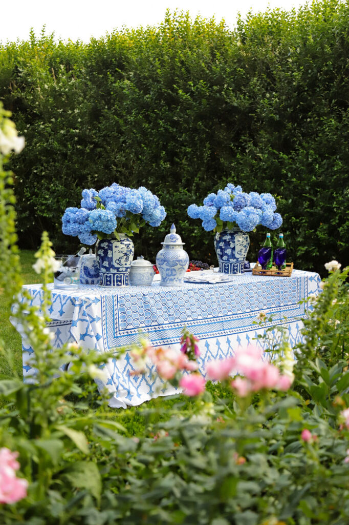
I’ve chosen to use a similar blue and white color palette for the decor, as I’ve used throughout most of the home, to tie the whole space together!
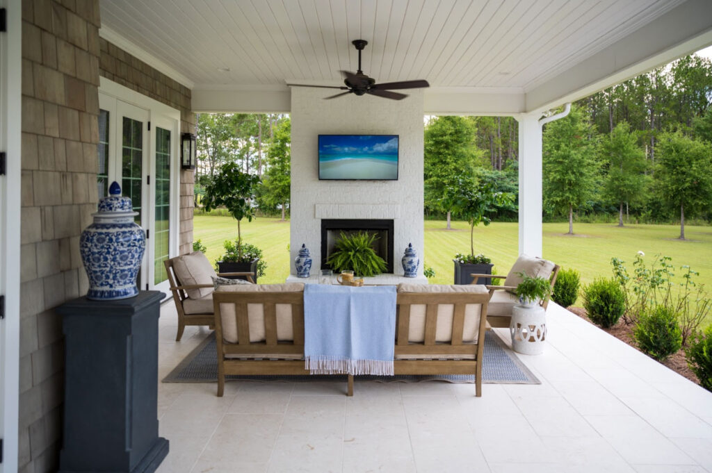
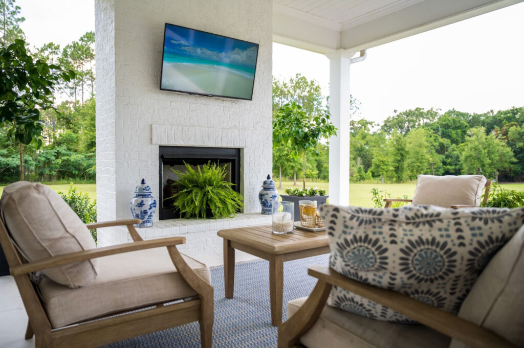
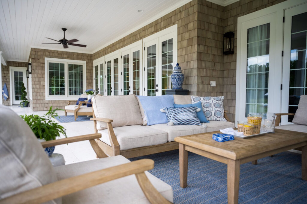
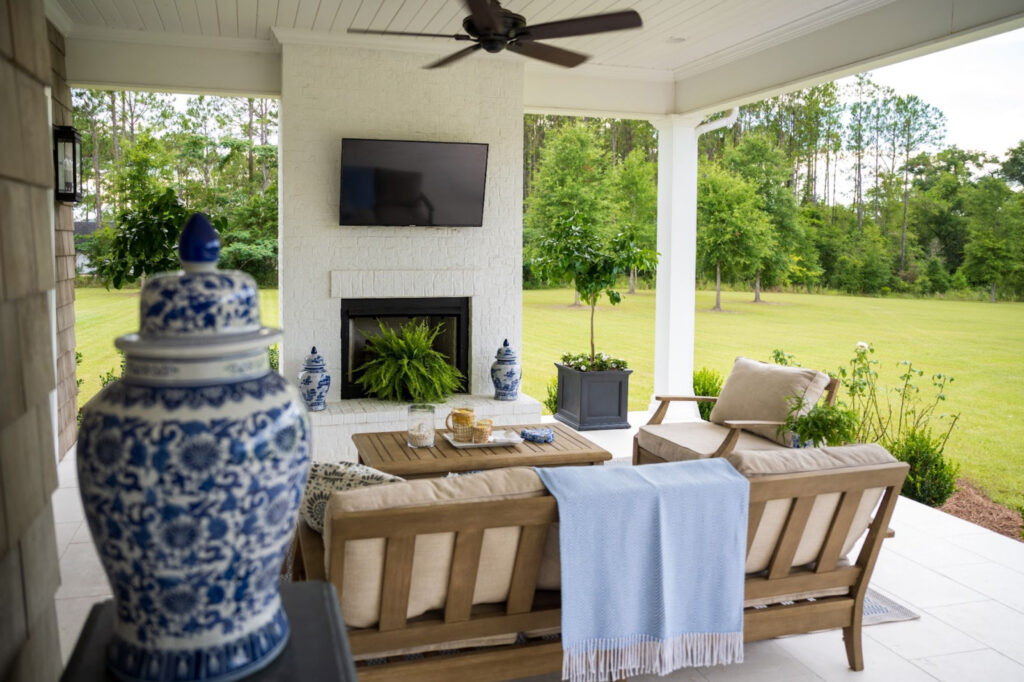
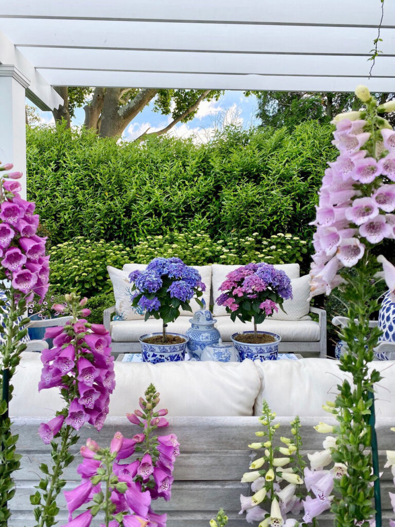
Outdoor Living
In addition to an outdoor dining area, an outdoor living space was just as important!
I’ve used outdoor area rugs to clearly define each space on the patio, which was particularly helpful for this cute set up that separates the dining and living areas.
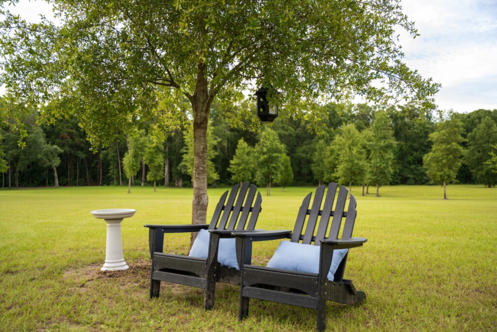
Outer Areas
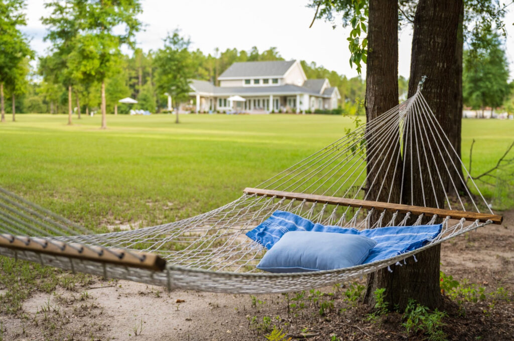
Our land extends much further than the pool, so I’ve created quiet little areas to sit and enjoy the sounds of the birds.
First up was a hammock! A firm favorite for my son Jack.
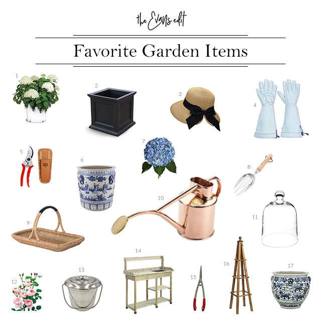
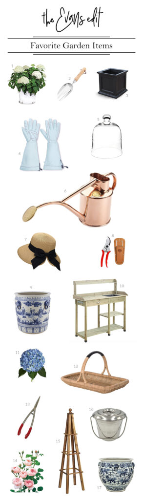
I’ve put together a list of my go to, tried and true favorite items, see below. If you fancy creating a similar garden at home, check out my favorite gardening tools!
Now that our new house is done and Spring is here, I’ve been able to focus more on the outside spaces. And specifically – get started with some gardening! Being located in Florida, as a family we spend a lot of time outdoors when the weather is good. It was a MUST to have some outdoor space and large garden areas.
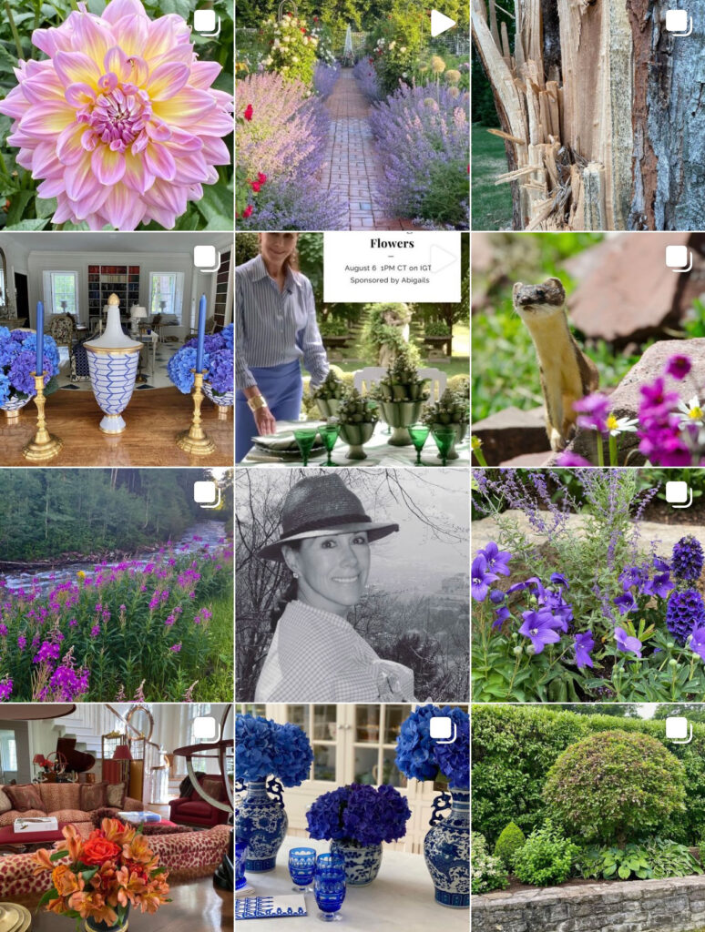
Before I share what I have (and haven’t!) been able to grow successfully, I wanted to showcase some of the incredible gardens and garden designers I am OBSESSED with!
The Starting Point
So where do you even begin with a new garden that’s completely bare?!
Pinterest of course! I saved a bunch of inspirational images waaaay back before we even started designing the house itself, and the gardens were a huge part of it.
Here are some of the initial images I saved and a snippet from my Pinterest Boards.
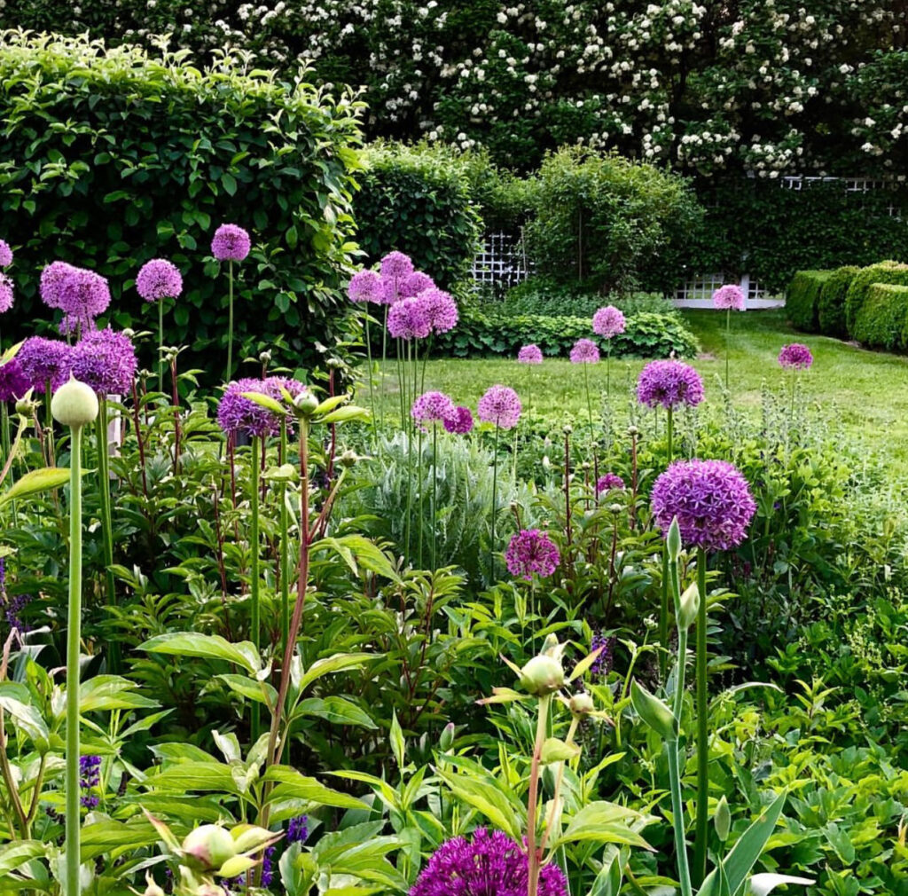
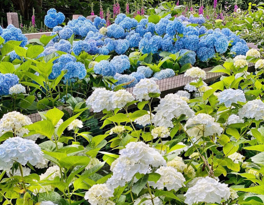
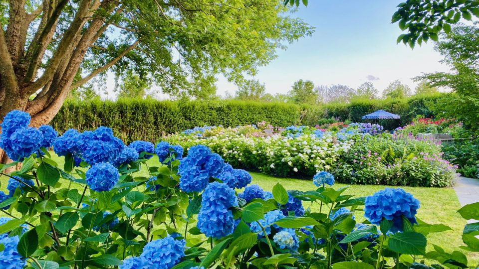
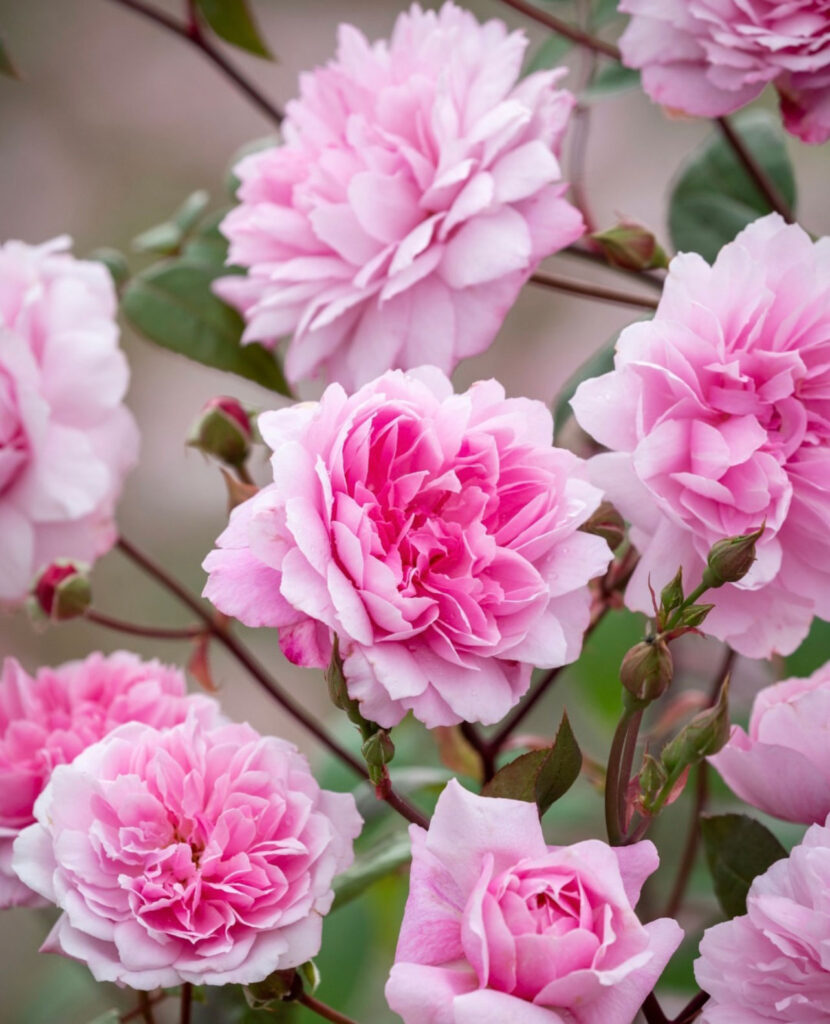
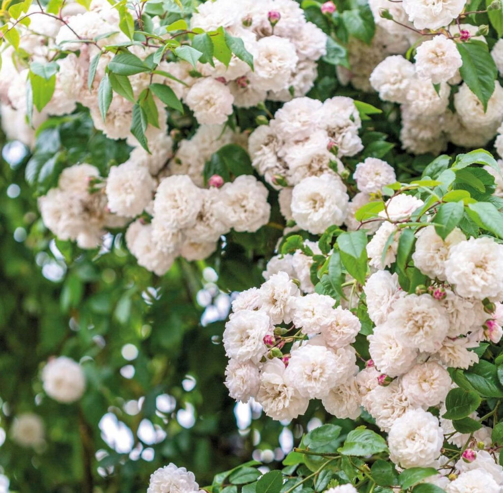
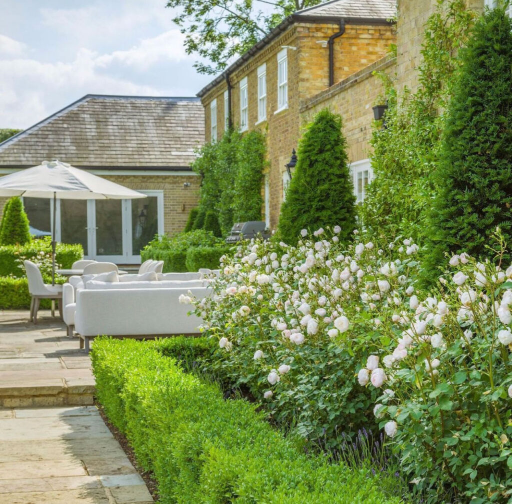
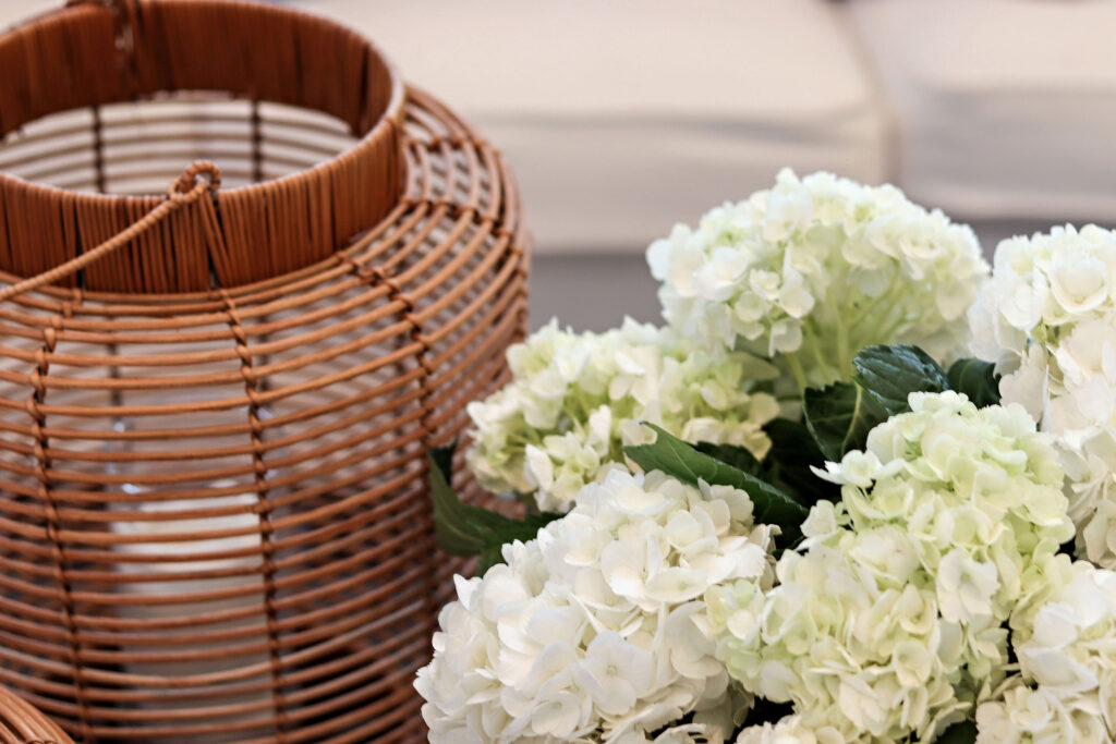
As you can see, there’s a bit of a theme starting! I knew I wanted lots of greenery, hydrangeas and roses, as they are all key flowers of the Hamptons. And if you’re a frequent reader here, you’ll know I love the Hamptons style!
The Pinterest boards were a little chaotic, so I did some research and there’s a number of designers and bloggers that I have started to follow! Their gardens are absolutely STUNNING and having these key inspirational sources means I can (try to) keep my garden areas looking on point!
Let’s dive in!
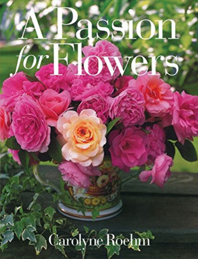
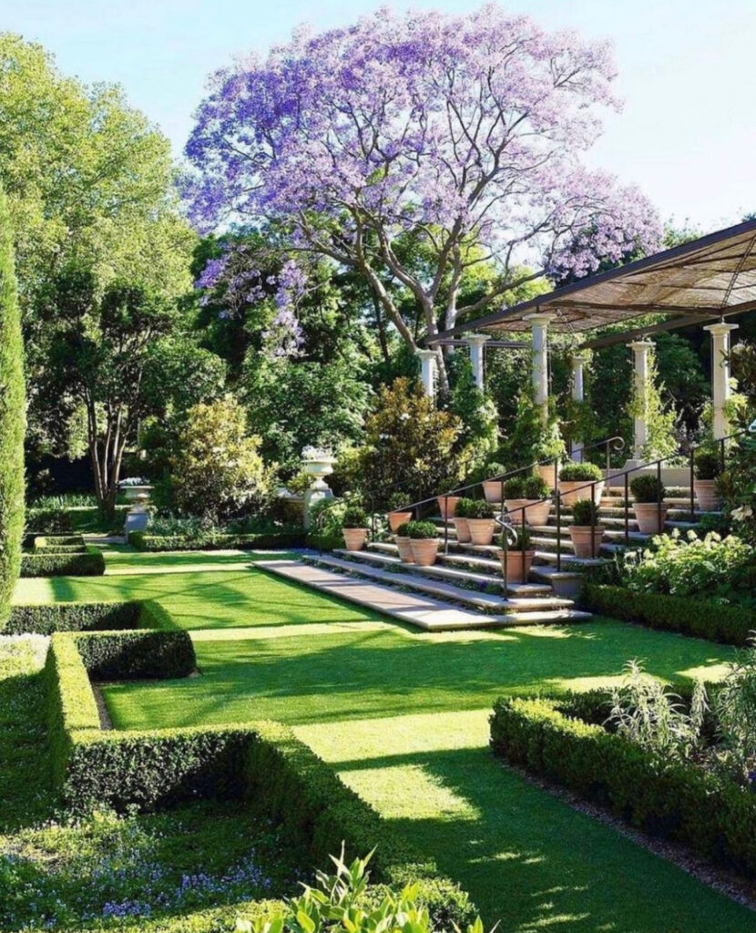
1. Carolyne Roehm
Someone else’s gardens I’m obsessed with is Carolyne Roehm! Her garden style is beautiful and she has some fantastic garden books too. It’s like she’s a one stop shop; she grows the flowers, designs gardens, photographs the gardens/flowers, and writes the book. She does it all!
Among all my research I’ve learnt that it’s important to have plants and flowers that blossom into differing heights. It adds visual interest to the outdoors!
I am totally OBSESSED with Kelli and her garden style. She has a blog that I follow for all things Hamptons and the lavish lifestyle that comes with it.
Keeping the color scheme simple and having a relaxed approach like this has definitely inspired me and my garden spaces!
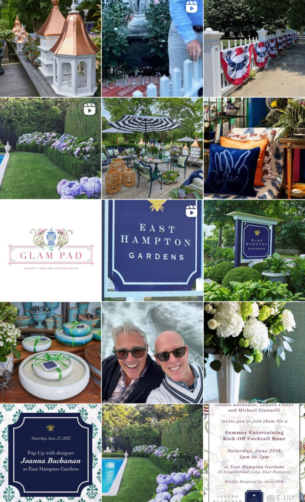
3. East Hampton Gardens
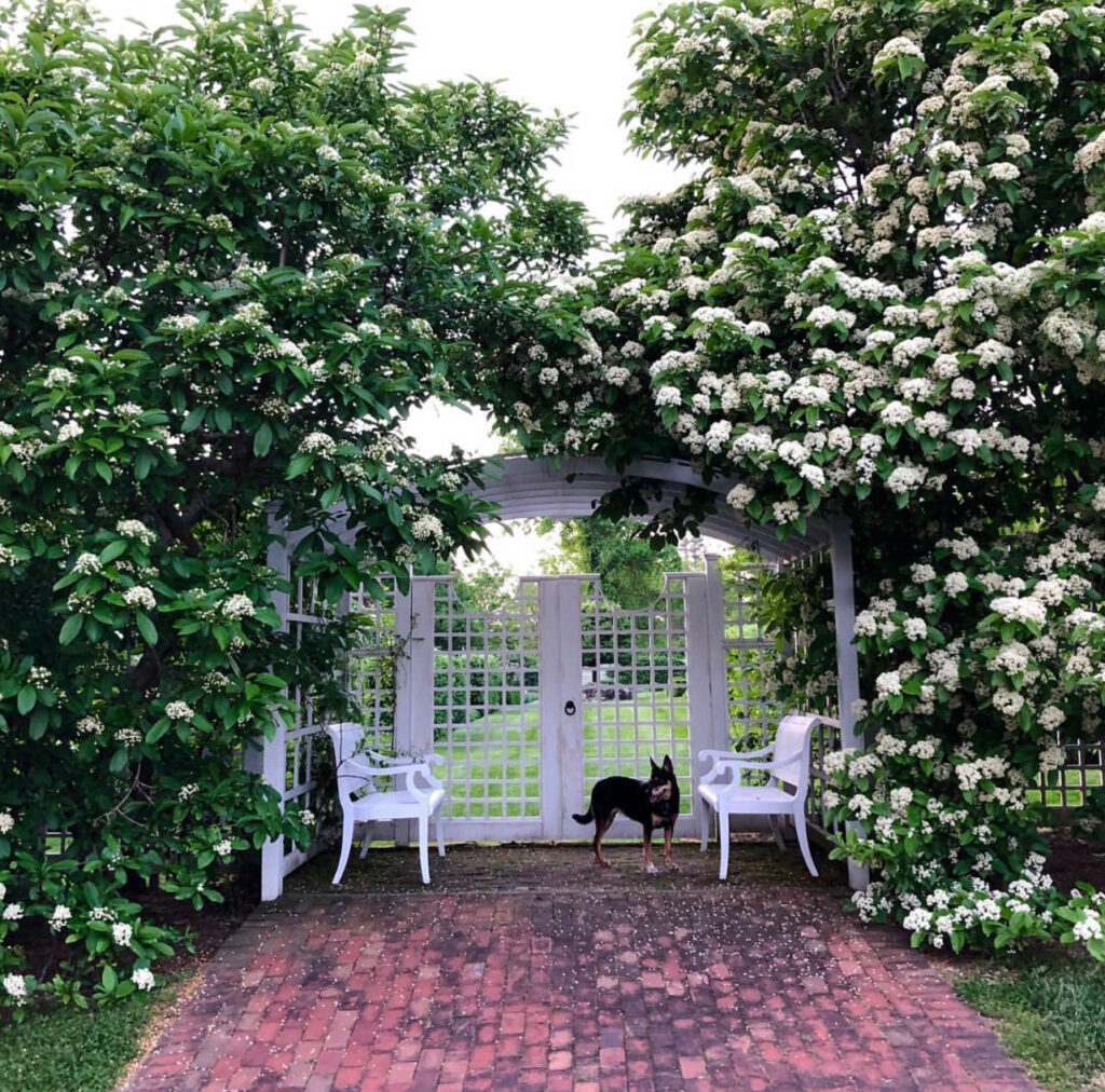
East Hampton Gardens is actually a retail store, which I love! Aside from the beautiful Hamptons style accessories and scenery, the owner – Michael Giannelli – has stunning gardens that he posts about. It’s perfect!
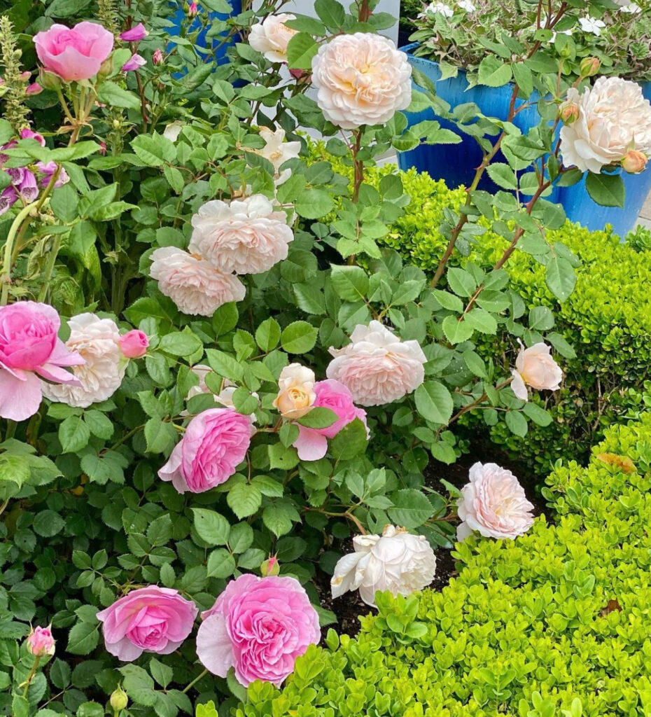
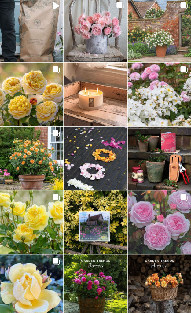
The OG of English roses, David Austin is my go-to for any and all thing roses. They have mastered hybridizing roses to *look* like the more difficult, only blooming once a year style of Garden Roses with the newer Hybrid tea varieties that bloom continually. Its a beautiful mix of two worlds that makes growing gorgeous, peony style roses possible for the masses, like me! I hands down wouldn’t be able to grow and care for Roses without the help from the David Austin Roses website! They are an English rose vendor, with gardens in England, that I LOVE. Roses are the perfect flower to use to add more color and something different other than my favorite hydrangeas. Fun fact, most of their roses are named for literary characters.
I plan to visit David Austin Roses in England next summer, but until then – I’ll keep swooning over their website!
You can explore all of David Austin’s beautiful roses HERE.
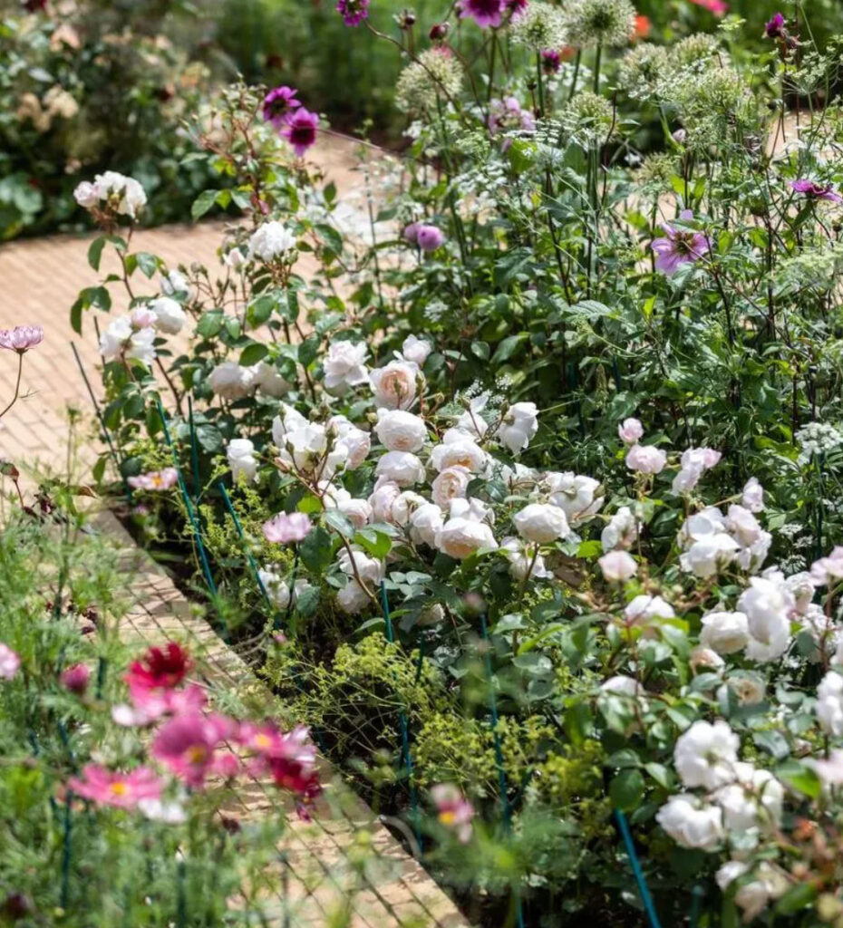
Another incredible white floral bed finished with box hedges. So dreamy!
So, this is just the beginning. I have the gardening bug and am hell bent on learning how to grow and care for these things! I’ve learned a thing or two over the past year and as soon as my garden has taken shape, I’ll share. Right now things are just starting to bloom.
I’ve put together a list of my go to, tried and true favorite items, see below. If you fancy creating a similar garden at home, check out my favorite gardening tools!
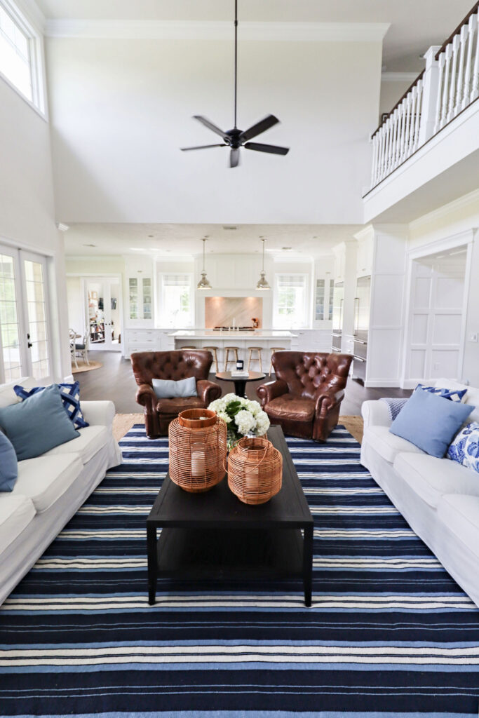
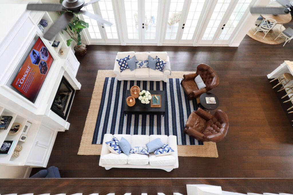
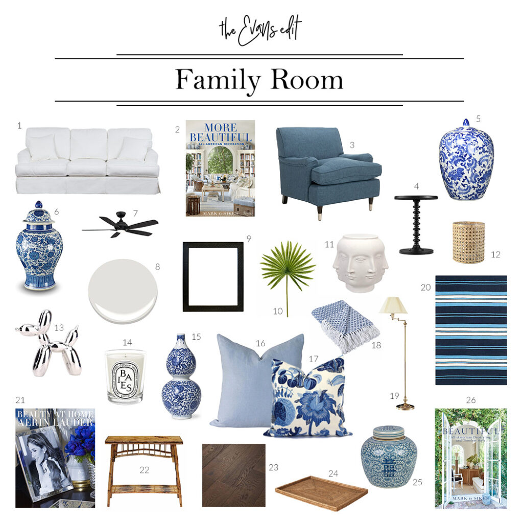
The family room is an important area of any family home, and it’s no different for our family! We love to hang out together after a meal, or while one is cooking, and catch up. The family room in our dream home is central to everything else in the house so the design for it was crucial to get right.
Let’s explore the design and details of the family room! Each item is linked below, so be sure to scroll all the way down.
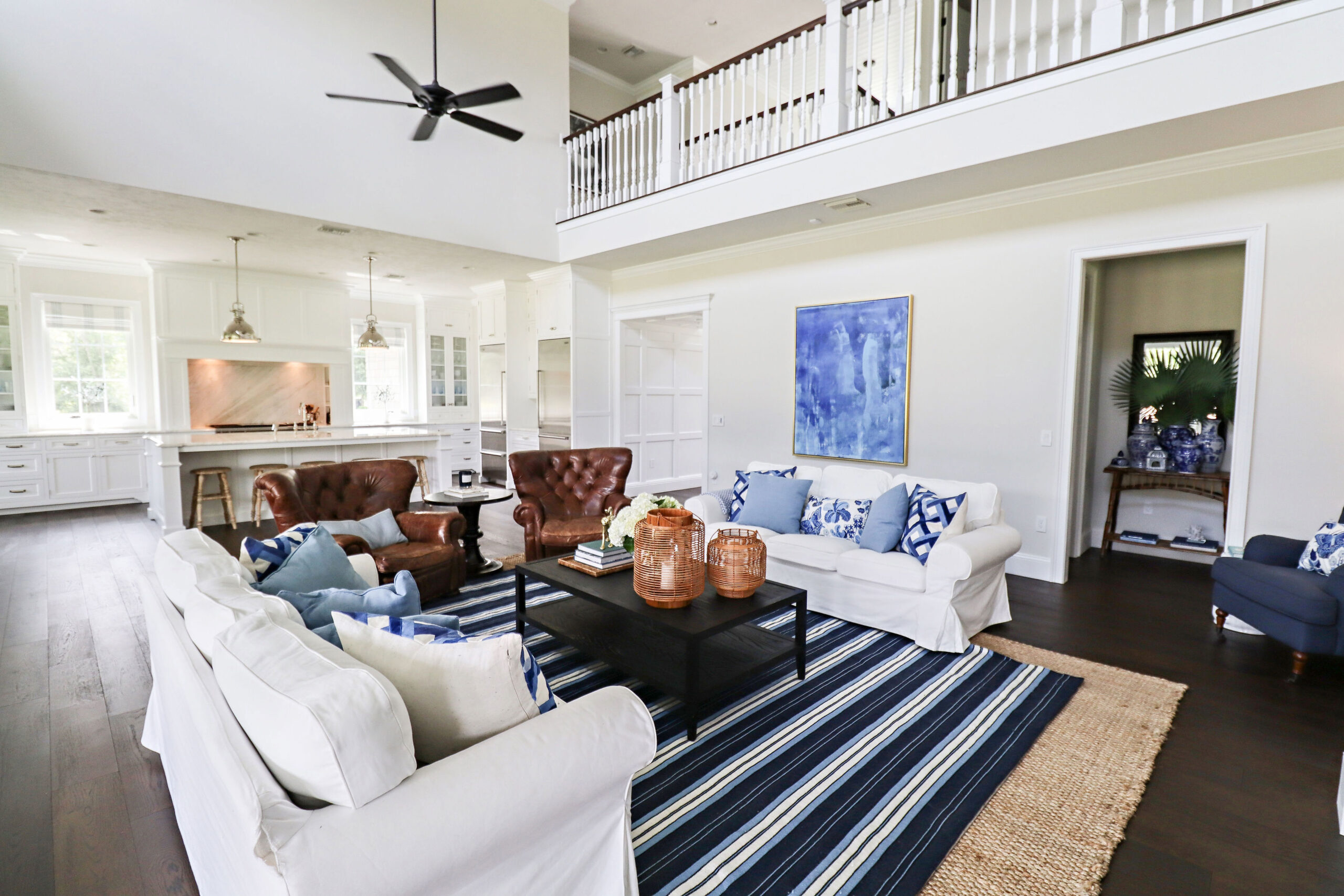
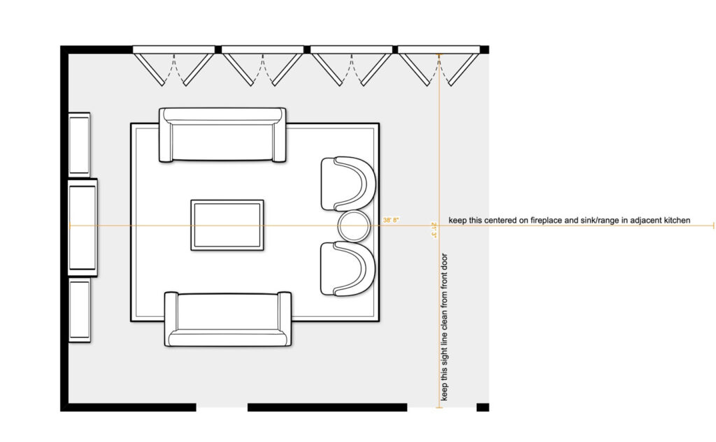
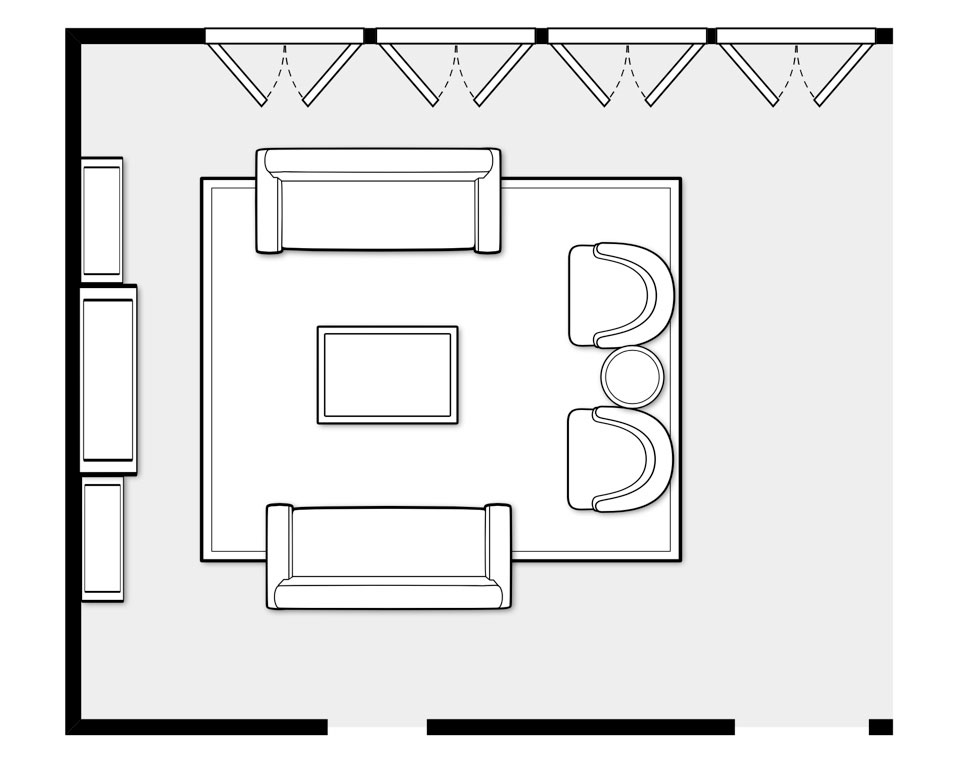
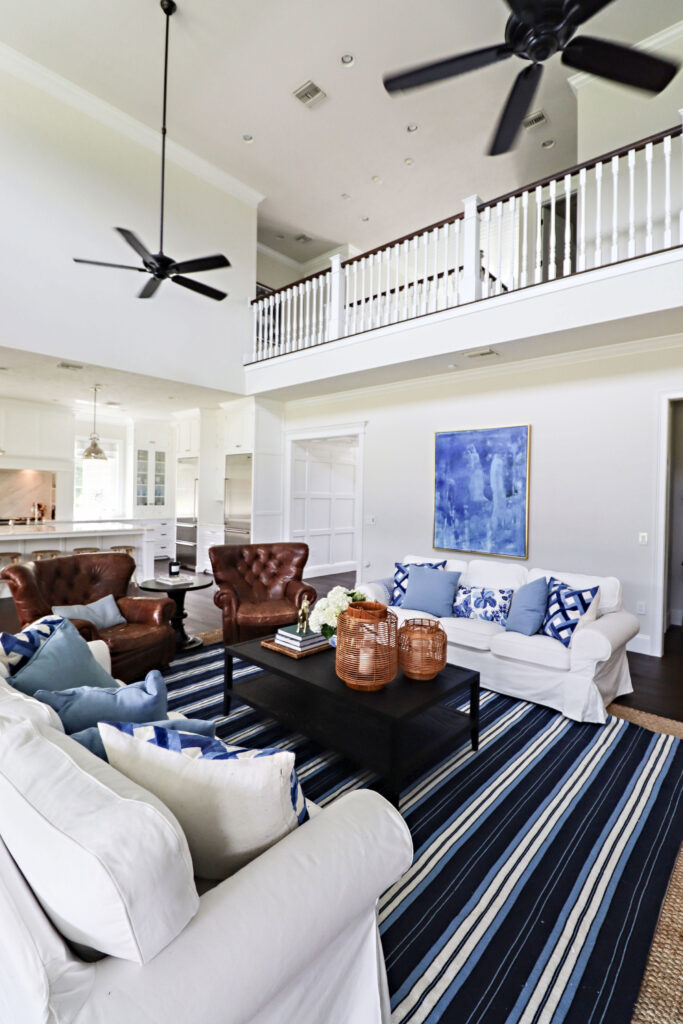
The design for the family room started as a result of being visible from the front door and foyer. Because of this, it was so important to embrace these sight lines from the foyer, and have everything centered.
Also, I wanted to incorporate a builtin with bookcase space, a fireplace, and TV above. This was designed for the main large wall while all furniture would be centered around it.
It was so important to keep the sight lines from the foyer and kitchen island all centered and aligned.
When I was designing the floor plan for the house I knew it was important to me to have privacy so I made sure the sight line from the front door was exactly centered on one of the French door sets, looking directly to the pool out back, and not into any area with furniture.
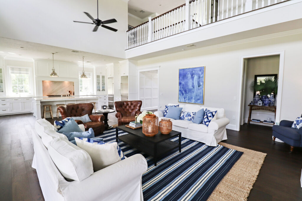
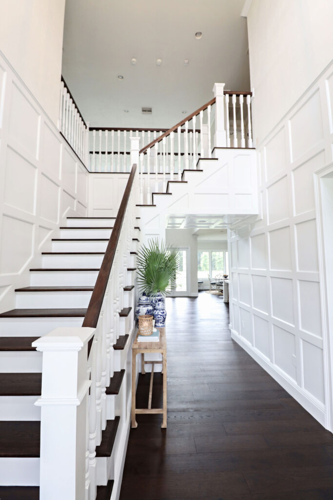
This is the view from the front door and foyer. As you can see, the only thing visible is the set of French doors that lead outside to the pool area.
Finishes
I wanted to keep the finishes simple in the family room because the space connects to other areas of the home and it’s open plan with the kitchen and dining area. The hardwood floors are from Shaw Floors, and you can read all about the journey of picking the perfect hardwood floor HERE.
All the trim work was painted to match all the others in the house, and the main wall color is Evans Greige.
For the furniture, I created a symmetrical layout with pieces that could be used for conversations or more informal TV watching. I selected two white linen covered sofas that face each other, two large leather wingback recliners adjacent to the sofas that faces the fireplace and TV above. The leather of the chairs bring a warmth to the area which helps to make the furniture arrangement feel cozier. The main coffee table, and side table between recliners, are black stained wood which helps to ground the whole furniture arrangement.
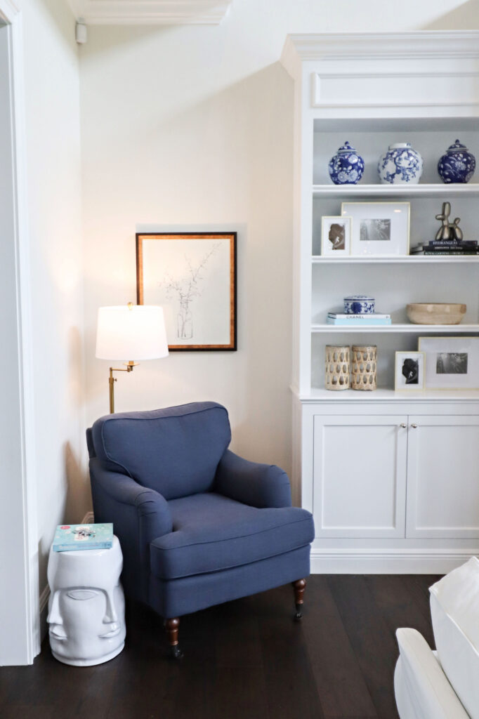
Off to the side of the fireplace builtin, I chose a blue linen armchair to create a little nook with a floor lamp, side table, and simple framed artwork. It’s a cute area that is great for reading a magazine on Sunday morning.
Instead of using traditional lighting in the family room, I have installed two ceiling fans from Fanimation. They are directly above the family room and help to circulate cooler air around the main living areas of the home.
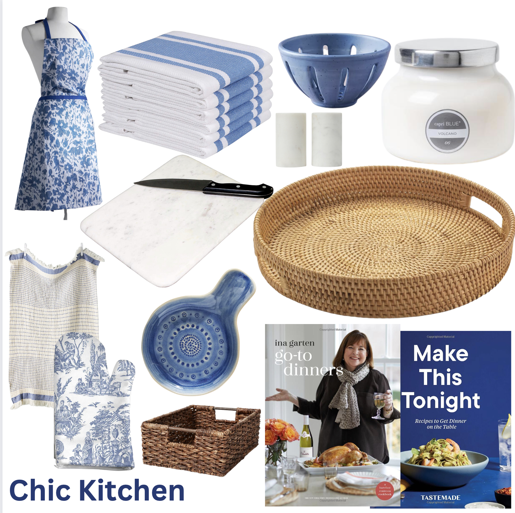
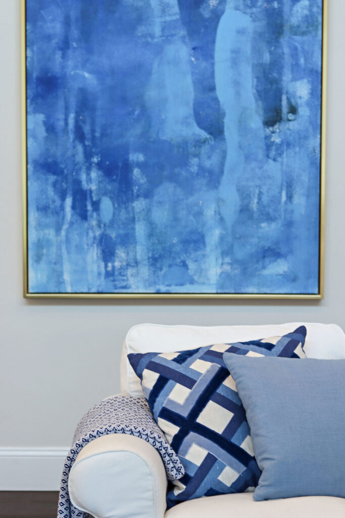
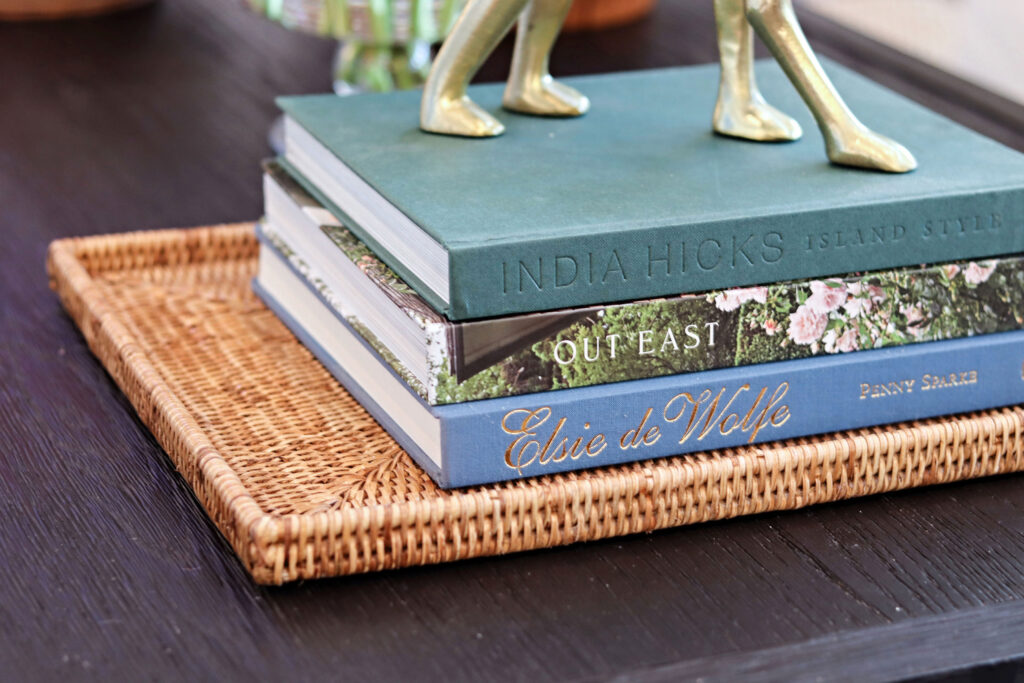
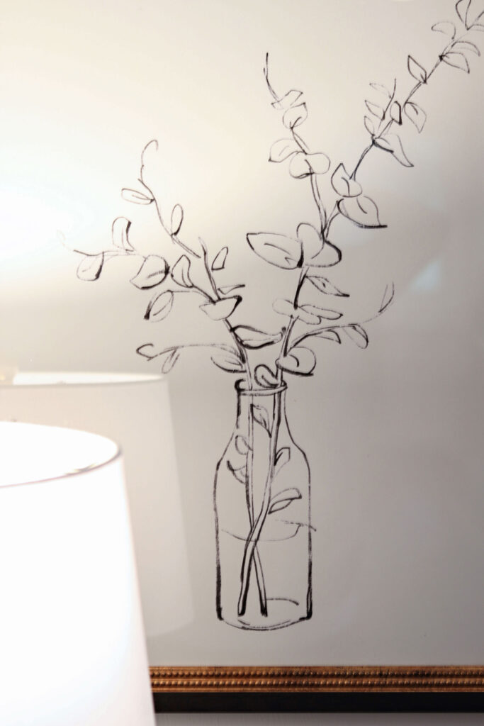
Artwork can totally transform a space and I wanted a piece that would tie all the blue tones of the family room together. The majority of artwork in the house is from One Kings Lane, and this beautiful piece is no different!
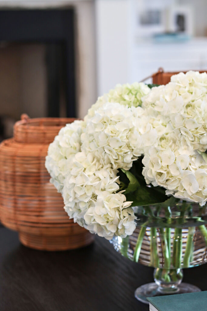
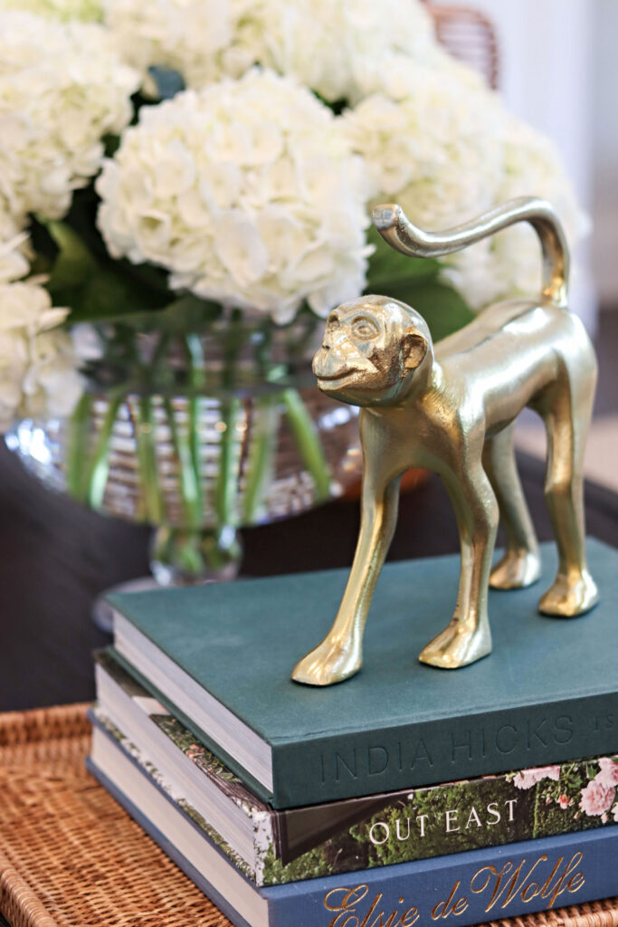
Home accessories are a key way of injecting personality into a home. I have chosen pieces for the family room that nod toward the inspirations for the whole house design, while keeping it relatively Coastal and Hamptons inspired too.
Hello there! I’m Lori Evans, Interior Designer and co-owner of Evans Construction & Design. Welcome to my world! I created this blog to share all the projects, tips, ideas and inspiration that I have. My goal is to help you make your rooms look even better than your Pinterest boards!